Screenshot / Dragon Force
-
 12-September 16
-
 Silver Hills Amusement Park
-

 4 of 7
- Views 4,124
- Fans 7
- Comments 21
-
 Description
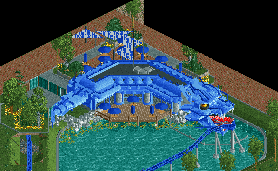
Fight the dragon and ride along on Dragon Force! Silver Hills' newest roller coaster. It is the tallest and fastest roller coaster in the park!
After the fight catch your breath and dine in Silver Hills' newest restaurant: The dragon's den.
Unfinished obviously -
 Full-Size
-
7 fans
 Fans of this screenshot
-
 Tags
Tags
So now we're flying we're free,
We're free before the thunderstorm.
On towards the wilderness,
Our quest carries on.
The dragon head is seriously impressive.
Tunnel entrance needs some work and I'm not 100% sold on the concept, but whatever excuse you need to shove a dragon head in there is fine with me.
Maybe a white or yellow for the umbrellas to avoid blue overload?
Looking forward to #recedarpoint
Yea the tunnel entrance is kinda shit I'm gonna redo that one. I experimented with different color umbrella's but tbh I'm not really sure what colour I like best. Might indeed be a good idea to change the colour to make sure this section doesn't become I'm blue irl.
I prefer this one Version1
Into the fires of forever we will fly through the heavens
With the power of the universe we stand strong together
Trough the forced of power, it will soon reach the hour
For victory we ride, fury of the storm!
Awesome song.
Awesome RCT. Great idea and well translated into the game. Good to hear that the tunnel entrance will be redone.
Awesome concept! With a few tweaks it'll be rock solid!
I'd personally have the coaster go in the dragon head, much more thrilling for the riders and cooler to look at.
Very cool though, interesting blend of styles for sure.
I love the fuck out of this but I wish it were going into the Dragon head. The cool theming is totally lost on riders at this point.
Wow, sick! Very original and great execution though I echo what G force said about the coaster going into the head, but nonetheless amazing screen!
You will have to do something with the paths because like this they look like a huge empty void. But maybe that's also because of the cut-out...
Great work!
Awesome stuff, dude! I really like it!
Clever idea combining a tunnel exit like that with a building that has some actual purpose! Besides looking great that makes it a lot more believable, and it would be a great spectacle for the guests in a real park. The coaster train coming out of the head (instead of going into it) kind of gives the impression of the dragon breathing fire.
Thanks for all the positive feedback guys.
@G Force, Coasterbill and FredD.
It's a bit late now to change it to the coaster going into the head . Also, the reason it is going out of the head is because the train is supposed to be the "fire" or maybe the "tongue" of the dragon as mintliqueur also stated.
@Faas
You get me
As of now, directly opposite of the head is the queue for the coaster itself. I may change this, but that may be kinda tricky since this is kinda at the edge of the map.
@Faas and FredD
The path will get some more details, this screen is pretty unfinished. As for making the surrounding area less boring, do you have any good suggestions Faas?
Too much blue (agree you should change the umbrella colours), form of the dragon head is phenomenal, but the tunnel entrance is weak (needs to look much more 'man-made', don't have foliage on top, thicker roof that isn't just a single-unit land block).
Have to agree with Liam. The head is cool, but the overall picture does not look good. The terrace looks very bland. Maybe some planters, a fountain and a nice willow would add some atmosphere.
@Stoksy
Thanks for the tips, I will change the tunnel entrance. I will also see if I can find a better colour for the umbrella's, maybe red?
@Liampie
I see your point, but on the other hand I'm going for a kinda realistic setting for my park, so I did not want to go too much over the top with the restaurant and just make it like a full on dragon. This is why I added things like the airco unit. It adds realism, and from the guests point of view it's not visible. I also tried to add legs and arms to the dragon body, but it just became too much of a mess and did not look realistic in my opinion. However I might try again because I think it would indeed look better if well executed. As for the surroundings, I have not really started on those, but I will at a later point of time, any suggestions on what I should add to make it look cooler/fit better?
@Sulakke
A fountain will be added, however the sprite limit is kinda working against me so I did not add it yet because I was not sure what other object to remove. The planters are a good Idea and I will try to add them.
@][ntamin22
Originally I wanted to add this to our parade of flags park, but then I ran out of time.
View from other side for reference (obviously unfinished):
I really like this, very different and cool ass dragon head!
One of the best, most realistic uses for a tunnel I have ever seen. I also love the dumpster made against the wall of the walled-in area next to the restaurant, so small yet so detailed.