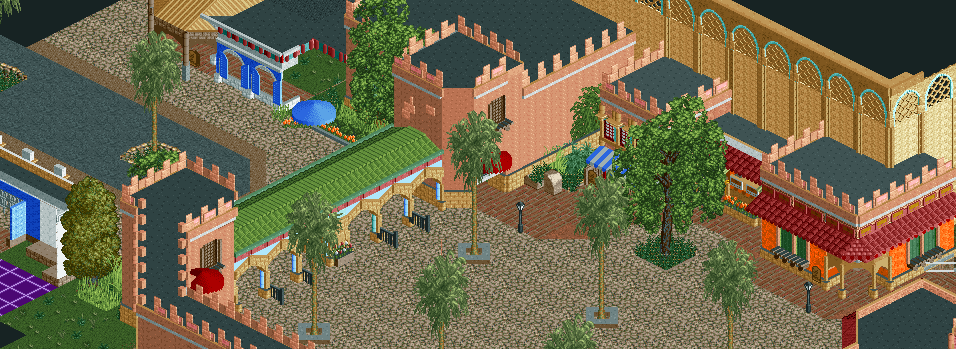
Screenshot / Busch Gardens: The Dark Continent-- Entrance
-
 26-October 13
- Views 2,830
- Fans 4
- Comments 12
-
 Description
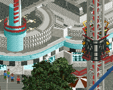
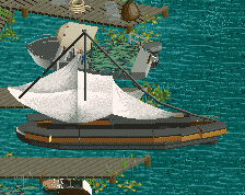
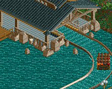
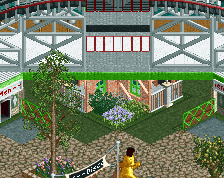
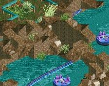
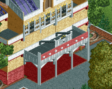
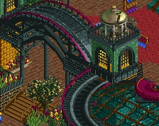
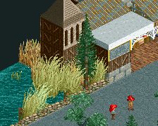
NEW FOR 2013-- The best vacation can be 10,000 miles away in Africa, or you can experience all of what the continent offers just a few miles away from home! Soak in what you would in Casablanca and Tangier by entering our new park in San Diego. Don't forget to pick up a fez and other 'local fare' to make the journey as surreal as the Sahara Desert.
-
 Full-Size
-
4 fans
 Fans of this screenshot
-
 Tags
Tags

Did you add more colors to this since i saw it last?
I love just about everything. The brick deco pieces used as parapets don't look that good imo, since they're so thin.
I agree about the deco pieces, but I can understand that blocks used in their place might look too thick. Regardless, there are some really nice scenes here. Good use of colour too.
It was the best option I could find for diagonal parapets.
Great use of those scenery items! I wonder what's in that large building...?
totally love this <3
Very nice!
Shotguns said : It was the best option I could find for diagonal parapets.
That's going to change...
^ Was it in the works already, or did this give you an idea?
needs more bush
this is good
In the works already.
Nice