Screenshot / Intamin LSM initial test
-
 08-September 16
- Views 4,672
- Fans 1
- Comments 24
-
 Description
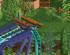
This is the first test of my Intamin trains in game. The lighting is wrong - I established that when I did the Mack train but then lost the new parameters I used for it, so I'll have to adjust it again.
These trains are problematic because a realistic layout can't be done without hacks - but at this point, I think it's probable that OpenRCT2 will eventually fill in the missing pieces, having already done so on the junior coaster. -
 Full-Size
-
1 fan
 Fans of this screenshot
-
 Tags
Tags

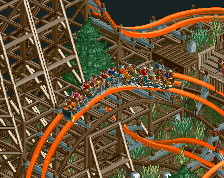
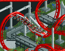
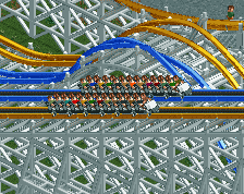
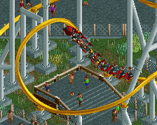
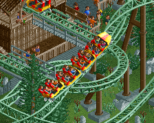
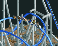
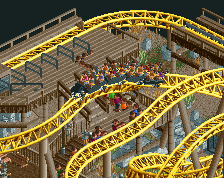
I think the trains look odd. I've thought that with all of your creations.
Don't get me wrong, I really appreciate the work that goes in, but I just dont think they ever fit the game.
And its not just your trains, it happens to a lot of objects and rides by others too.
They just look too sharp and well made if that makes sense? Not cartoony and a but duller like the real in game trains are.
Yeah, you're right. They don't match the look of the vanilla trains at all. And I've tried to get them to, but I just can't figure it out. I've tried to calculate the correct lighting parameters to use, but there's too many variables to solve for. I tried using a script to minimize the error - and the numbers come out close, but it just doesn't look right. I plotted the luminosity of the various remap colors on a graph, and tried to calculate a regression, but there were a lot of outliers. I have all the camera angles exactly, but anything related to lighting is basically a guess, and it's not even a good one.
It doesn't help that most of the shapes that are simple enough to use for this sort of test (land tiles, blocks and walls, etc) were probably drawn by hand rather than rendered.
There are also aliasing issues due to the low resolution. Anti aliasing can't really be done because it's indexed color. Sometimes I deliberately oversize small components (particularly restraints) in order to make them show up clearly, but then they end up looking too big.
I don't mind the look of the sprites, but I hate the inconsistency.
That probably has something to do with the in-game sprites "blending" pixels while custom trains, especially X7123M3-456's trains, having sharper contrast lines between pixels.
To be fair, I don't think any custom trains really fit the game perfectly. These are very close, some better than others. I think a problem is that they get a bit too pixilated and detailed, texture is a bit of an issues as well. Not sure if there is anything that can really be done about that though, so its not a big issue to me. As long as they look alright and you can make a good layout with them.
My bigger issue is the peep model and size, the RMC trains are tiny, and the peeps look super small in them. Similar case on some of the other trains, which to me is often the deal breaker before the model itself or the even the friction at times.
Yeah, I know about all these problems, but I just can't get it to look any better. I've been tweaking the lighting, but no matter what it's either lit too bright or with too little contrast. I don't know how to fix it, so I'm leaving it as it is. I'll get the preview made and aim to finish it today. At least, it's not as bad as the Intamin wing coaster.