Screenshot / #fbf - Wildfire and Firestorm
-
 02-September 16
-
 The Forces of Nature
-

 13 of 14
- Views 1,792
- Fans 0
- Comments 5
-
 Description
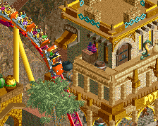
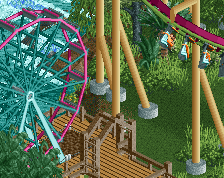
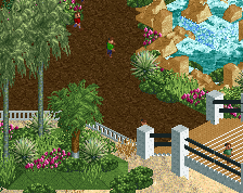
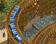
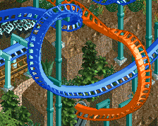
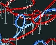
A flash-back and a flash-forward. This station was built almost two years ago, perhaps one of the oldest things in the park. The coasters were redesigned by Stoksy about a year ago, and in the last month I've finished the surroundings.
Coming to a NE download link near you!!!! -
 Full-Size
-
 No fans of this screenshot
-
 Tags
Tags
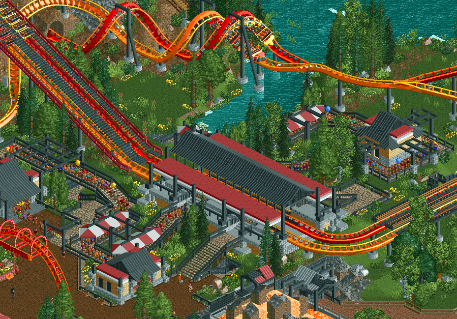
Not sure about the black here. Is everything supposed to be charred?
I don't really mind the black gives it a nice slick feeling. Perhaps its a bit overdone though near the bottom of the screen.
Station and queue look really cool, nice work!
It's a darker corner of the park in general. A lot more red brick in other buildings around this area, to punch some color into it. Not going too give to much away though, you'll need to check out the park for yourself when it's released ][22
Can't wait to see this in-game!
Thanks to the admins for the release:
Check it out: http://www.nedesigns...ure-theme-park/