Screenshot / Custom Supports WIP
-
 16-August 16
- Views 2,677
- Fans 1
- Comments 10
-
 Description
Alright, just wanted to get some feedback on the custom supports that I have been working on for the RMC. As you can see I tried to do a kind of uniform height for the connections between the vertical supports that applies to the whole coaster. Every 4 spaces a connection, 2 when the terrain or coaster forces me to. I really hope it doesn't end up looking awkward (for example the supports behind the first drop line up). The next step is going to be the supports of the loop (these will be very tricky) the zero-g stall and the lifthill after that. When everything is done the lateral supports will be added (already placed the footers, nothing final though). I'm not saying that I don't have fun building, but it is very tedious, so please let me know if you think I made some mistakes; the earlier the better.
EDIT: For whatever reason I cannot crop the thumbnail. I never accepts my edit. -
 Full-Size
-
1 fan
 Fans of this screenshot
-
 Tags
Tags
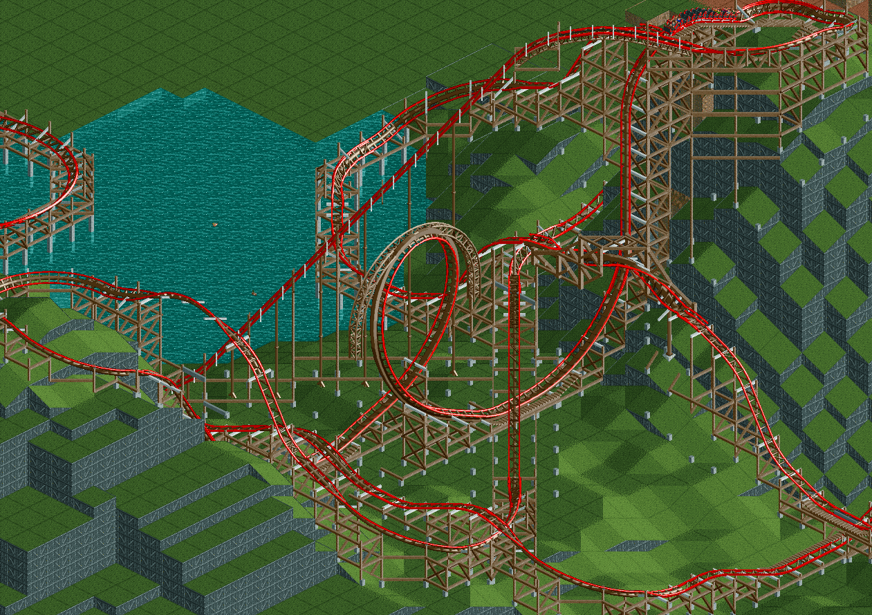
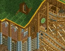
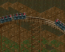
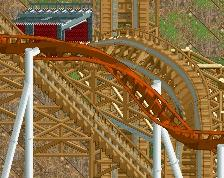
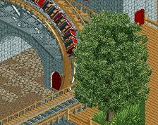
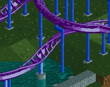
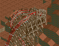
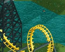
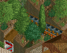
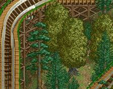
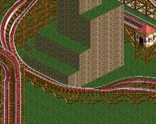
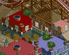
Also, got another question: I'm a bit conflicted as to what i should do with the situation marked in the red circle. Essentially the connections below that wouldn't even connect to the other supports, they'd just scrape the rock wall. I had a similar problem with the supports on the first drop, but I solved that problem by throwing in some landblocks (see blue circle). No idea yet how to make this look better, do you think I should do something about it? Right now I just hope that the lateral supports will cover it up.
I think you need to stop asking us for advice on ever little tiny step you make. You're a good builder, you dont need us to walk you trough every little aspect of building and advise you on each small issue.
If you play like that you'll never get passed the layout stage, which seems to be your case.
Just try and finish some screens and actually give us something to critique. Because to me there is nothing to say about this, other than its unfinished and hard to judge.
Not trying to be a dick or hard on you, but if all you're going to post is partially supported layouts, people are just going to stop caring after a while.
edit: also agree with G Force. You're definitely skilled enough to create cool shit without our constant feedback. Finish an area and surprise us with it.
+1 for tactically placed pine trees.
Why the wooden land edges?
+1 for Needs more finish
It's crazy that I look at this and think "Man a loop on an RMC seems kinda tame"
It's a freaking wooden coaster. Someone from 10 years ago wouldve been blown away.
Yeah, you guys are right, I am overthinking this. What I forgot to mention is that the grass texture and the wooden land edges are just a visual aid when I am constructing, cause it gives a good contrast to the brown supports. I'm still 90% sure that I will go with the inital desert landscape, so using the pine will probably not be an option.
And Austin, I am genuinely surprised that RMC hasn't done a loop yet. It is probably too much of a basic inversion for them.