Screenshot / Coit Park - Charlevoix
-
 14-August 16
- Views 2,117
- Fans 0
- Comments 7
-
 Description
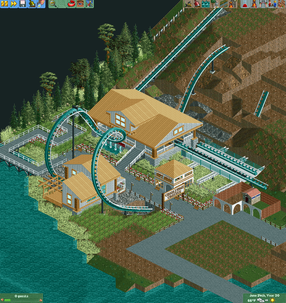
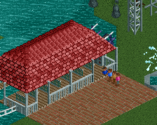
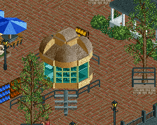
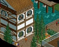
The start of my project. I haven't done any supports yet. I did have a layout but I wasn't fond of it so deleted it, and am going to be building on to it slowly. The building inbetween the cobra roll is a restaurant. I'm looking for heavy critique. I've never seriously delved into a project before, I always just played the scenarios from a winning prospective. Only thing I'm decent at is woodies, so I figured a Steel Twister would be a good place to start. The area going into the coaster will be based off a Charlevoix here in Michigan along the lake.
-
 Full-Size
-
 No fans of this screenshot
-
 Tags
Tags
Hey I live in Michigan too, I'm in Detroit. However this coming weekend I will be in harbor springs for a wedding so I'll be right by you!
I think the cobra roll looks awkward to. I also don't understand why there is so much weeds under the transfer track. I feel a real park would take care of that since they wouldn't want overgrown weeds on the tracks and stuff. Anyway, I like the station and the fountains in front of it. I would maybe try changing up the roof textures on the other buildings though.
I'm kinda of happy with how the little restaurant turned out, and if I narrow the cobra roll where it is, I lose the restaurant. Would having it come out near the water work better? I thought it looked awkward too, but it wasn't until I had the building built, that I realized it.
I liked the tiled path due to lack of fence on the queue line. Would maybe going with an invisible path and the wood planks look better? My only qualm about that method is that the fences get "buried" in the planks. And good queue paths come to mind?
I appreciate all of the great advice. I'm going to see what I can do with it!
I tried adjusting the cobra roll a bit. I added a picture as well. Yay or Nay?
Attached Thumbnails
Cobra Roll looks better now, definitely keep it like that. Architecture is good, foliage is the real gripe with me. Too much repetition and grass for my taste.
Normally I would say that its positioning around the restaurant is excuse enough to keep the cobra roll as it was before (you can only do so much with the in game limits, y'know.) But if you can pull it off in this position, go right ahead.