Screenshot / needs more progress
-
 12-August 16
- Views 2,075
- Fans 0
- Comments 13
-
 Description
Hiya.
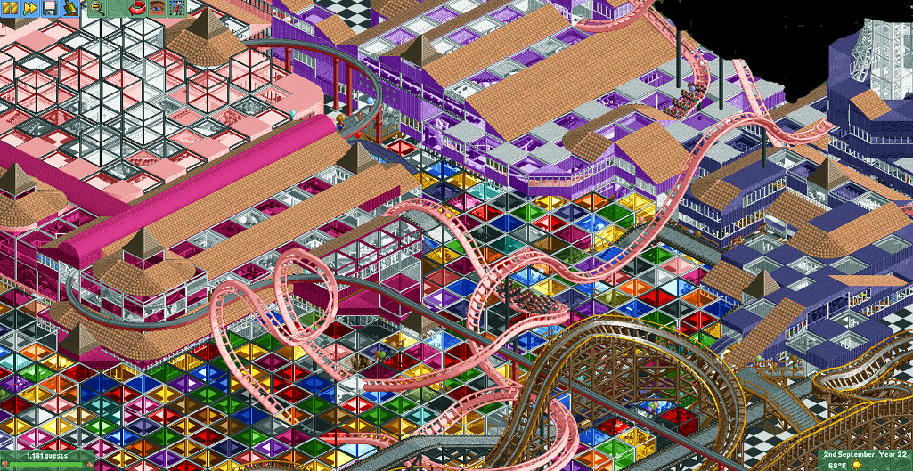
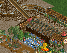
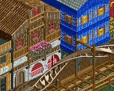
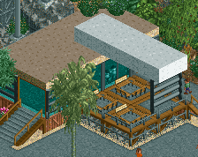
I decided to put cubes everywhere rather than just around the edges. This is from the same angle as my last screenshot. Guest numbers are low right now since everybody left when I flooded the park with peeps but they'll be higher if/when I release this. Peeps with balloons kinda make the cubes flicker, which is a cool effect actually. Lower right is uncubed because I'm planning a building attached to the dark blue one there. Once again, it's difficult to see in a still image but you can see quite a lot of motion from the peeps, karts, and cars below the cubes. Thanks! -
 Full-Size
-
 No fans of this screenshot
-
 Tags
Tags
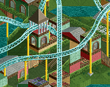
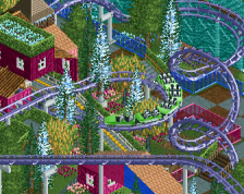
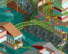
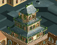
Am just now seeing that I missed the spot beneath the monorail in front of the light purple building. Oh well, that'll be filled with cubes too.
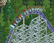
It would be cool if you could do something more with the coaster supports. Maybe like FKs abstract work.
Yeah, I don't quite love how the coaster looks floating. I tried playing around with trackitecture/ scenery supports but I couldn't really find a way that I liked- most of them took up too much space and obscured a lot (it's a cramped park, obviously). I see this is getting some very low votes, and that tells me that people think this is terrible. I'd appreciate it if I can hear some specific criticism, and whether there are things I could improve to make this better or whether the entire theme/execution is just awful.
It's just a mess of glass. I can't focus on anything, things don't come together, and it makes my eyes hurt. Something like what Fk does is at least contrasted by the black tiled background, and is done in relative moderation. Here, the checkerboard tiles just make it even worse, there's nowhere to rest my eyes, and there's this ugly brown wooden coaster which doesn't compliment or contrast the rest.
I'm not convinced a park of any size can be made in this style. I commend the effort but it really doesn't appeal to me in the slightest.
Fair enough, I appreciate the response. It is definitely hectic, and while it isn't uncomfortable to look at for me, I can see where it can be for others. I've been considering painting the cubes into bands of color or just getting rid of a bunch of them. I think it will be better when I fill more buildings in- I'm planning to have the majority of the park space to be buildings like the one in this screenshot so it won't be big rainbow plains everywhere, hopefully. The colors on the woodie are terrible, I agree. That was actually the default building color that I forgot to change, that coaster isn't even a complete circuit yet. I still think something good can come out of this and I'm enjoying building it so I'm gonna push ahead, and if it ends up terrible, so be it.
I think you might like this:
http://www.nedesigns...9/rainbow-road/
Obviously it's not an 'NE style' park but I liked it. Add some cohesiveness to this, particularly with color and I think it would look pretty cool.
To me this screen just seems too busy. I like the idea of the cubes on a smaller scale but there is just too much going on for anything to capture my attention. I really like the interaction of the monorail with the two coasters and would like to see more of the structure surrounding the roto drop, but the overall aesthetic doesn't work the best for me.
I feel like you just did random stuff and not really planned anything out?
I wouldn't say it's completely unplanned. This is me experimenting, and I'm gonna end up trying terrible ideas like the cubes. I'm probably going to repaint them into bands of color, which would fit the plans I have for the rest of the park better anyway. As I said, I'm enjoying this project and I want to continue on with it, and we'll see where it goes. I'll definitely be watching the eye strain and hopefully the final product won't be painful. Thank you all for the replies, I appreciate hearing specific feedback.
I love this! Keep it up!
Not to mention the classic -
http://www.nedesigns...k/53/igno-reme/
Ge-Ride did a good job of keeping abstract color and form manageable due to the way he tended to frame everything in black.
No, Angroc, I love you.
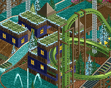
That park is seriously amazing. Speaking of framing the colors to keep it readable, I actually have a save of this park with the cubes suspended in water.
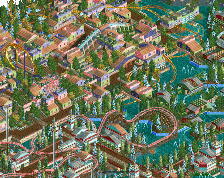
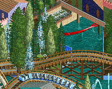
Apologies for the blankness everywhere, I just wanted to show how the cubes looked in water. The problem with going ahead with this is since the cubes need to be zero clearance'd, it's very difficult to avoid accidentally placing multiple cubes on the same square, although hopefully that isn't a huge problem.
Is water a good idea to try to frame it better, or should I ditch that idea and just stick to repainting the cubes into swaths of color rather than a random checkerboard seizure?
Maybe keep the checkerboard but repaint the cubes with uniform black borders and similar colors? I think a sea of purple/pink cubes would keep the chaotic effect that I'm going for but cut down on the eyestrain.
The problem is the checkerboard land, water does not add or change anything from that.