Screenshot / needs more glass
-
 04-August 16
- Views 1,216
- Fans 0
- Comments 5
-
 Description
Hiya. It's been a while, although not for lack of trying.
Anyhow, I was dabbling around in my large, depressing save file. I found this ancient save file of mine featuring a web of coasters and tracked rides with an, *ahem*, spartan pathing system. No architecture or scenery or any kind.
So I figured this was as good a canvas as anything to practice my woeful large-scale architecture and began throwing together a random passion pink building. And then I just randomly lowered the ground, made it checkered and threw tons and tons of rainbow cubes down in there. And then I attached two purple buildings to my pink friend, trying to mimic the style. Now, looking at it, I think this might just be going somewhere. Somewhere good, I don't know, but somewhere, which is an accomplishment for me.
I present this here now with unfinished parts around the side because I want guidance and opinions before I go any further. Right now the plan is to try to fill most of the park space with buildings of a similar style (lots of glass and windows to show the spidery coasters, each one a different color), and filling the rest of the space with the rainbow cube sea. I'm torn between two main points about what to do with the cubes- should I keep the colors completely random or paint rainbow-like bands, and should I fill ALL the space with cubes or just the edges, making the park an island.
Let me know if you think this is worth putting more work into, any improvements I can make, and whether these cubes are a terrible idea or not. Thanks! -
 Full-Size
-
 No fans of this screenshot
-
 Tags
Tags
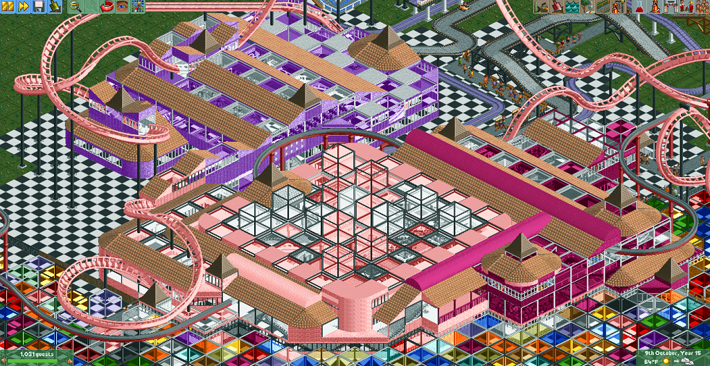
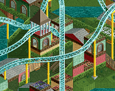
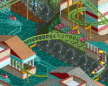
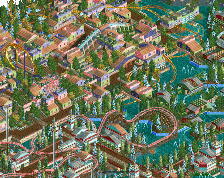
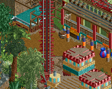
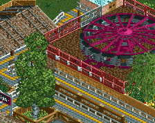
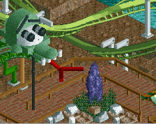
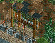
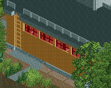
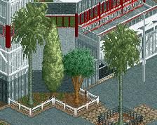
This really isn't the best angle, and it's hard to tell from just a still picture, but the glass bits show a lot of motion from all the moving bits inside, which I really like. Obviously this isn't really meant to be a realistic park so much as it is an interesting thing to look at.
Keep going and build something chaotic, monstrous, and impossible... make it some weird geometric abstract park, that'd be cool.
To me it looks a bit confused, like stuck between on the one hand the ambition to make a heavily spaced-out but still plausible theme park, and on the other hand an urge to go completely into some sort of abstract RCT art piece... If you want to practice your architecture skills, as you say, I think it would be a better idea to calm the area down, clean it up a bit, and focus on the first approach, as in, just try to build a good fantasy-style park.
Yeah, that pretty much sums up where I'm at. I'm tempted to go pretty crazy and try to make something really abstract, but I keep trying silly things like zero clearanc'ing cubes everywhere or placing randomly colored glass roofs high above the ground and try and mess with perspective and whatnot, and it ends up being just an unrecognizable mess. The buildings were actually originally almost entirely glass, but it was very difficult to make out their shapes and they just were blobs of color. So I added some solid walls and roofs and that's where I am now.
Speaking of the roofs, I actually tried the grey ones first, but I needed the curved pieces so I was forced into tan for many of them and I just didn't like how it looked with mixed colors. I almost like the uniform roof colors, it kinda restores some order while everything else is chaos.
I'll try adding more cubes everywhere and see where that takes me.