Screenshot / Twelve Birch Park
-
 02-August 16
- Views 1,865
- Fans 0
- Comments 9
-
 Description
Hello everyone!
I've been a long time lurker and enjoyed snooping around, looking at all these wonderful parks and screenshots. They've given me a lot of inspiration with my own parks and I've finally decided to just join and upload some bits and pieces.
If there's anything I should know before I settle in, I'd be happy to hear it!
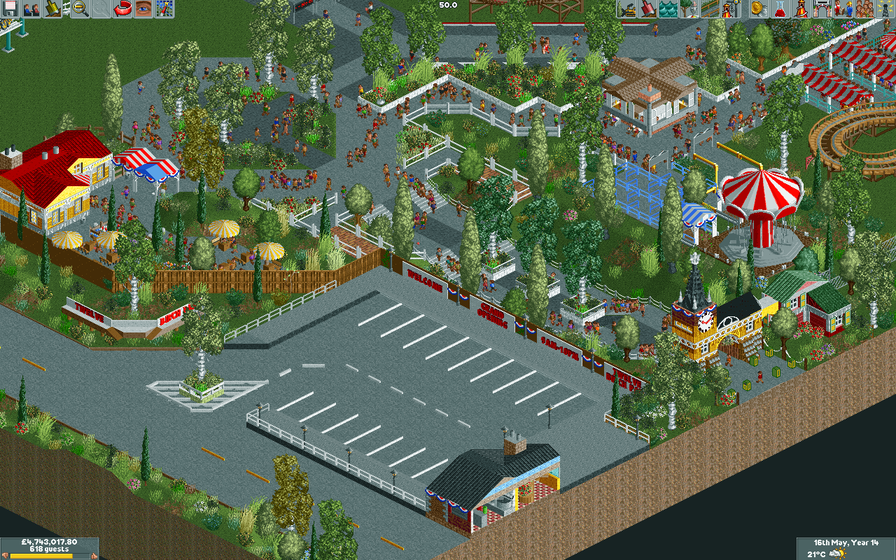
In the meantime, I hope you enjoy this little teaser for a park I'm currently co-working on with a fellow called X Louis and a couple others (the wonders of ORCT multiplayer). We're just starting out and it's designed to be a small American park of the 80's, possibly 90's. This depicts the entrance area as it currently is, much of which is my work, though I can't take credit for the Coaster, or the depression in the ground, which is all on X Louis. I'm open for feedback and I'm sure that X Louis is too! -
 Full-Size
-
 No fans of this screenshot
-
 Tags
Tags


I really like the vibe, but some of the objects are just not very pleasant to the eye. Best if you replace those white fences and trashcans at the entrance.
Also replace the diagonal wooden fence you have with ITMs version. Found in BGA, Westwinds among many other parks...
I love this. Great start! Welcome.
how do you get to the entrance?
Very cool and very colorful... I like that building's interior.
I feel the colors could use some work. Also I would fix that umbrella by the fence and change those diagonal wooden fences like G Force said. When I saw the screenshot title btw I thought it said Twelve Bitch Park lol.
Thanks for all your positive comments! And thanks for the tips as well; me and X Louis (along with some other contribtuors, none of whom I know to be registered here) have been adjusting accordingly and the results speak for themselves. I think I'll hold off on an updated screenshot for a while, since there's still a lot of work to do.
The idea is that the path from the building with the cutaway loops around back to where the entrance is. It's not super clear right now, I'll admit, but I think that's fixable.
I actually did help a bit with the park on X Louis's server, but it was after this screenshot and none of my work is in the current area, anyways. In the future, though, if you'd like to check with me to see if my work is in the screenshot, that'd be wonderful.
Anyways, the park is coming along brilliantly. The parking lot is very well designed, and the entrance path looks nice and organic with the terrain variations.