Screenshot / Bandit & Serengeti Balloon Safaris
-
 28-July 16
-
 G Force's Worlds of Fun
-

 11 of 13
- Views 3,741
- Fans 1
- Comments 27
-
 Description
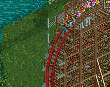
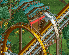
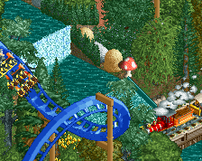
A view of Bandit's speedy river skimming drop and a portion of Africa, featuring Serengeti Balloon Safaris. A Huss spinning balloon ride themed to a adventurous African Safari.
The park is essentially finished, just sitting on it for a bit and cleaning up some objects. As well as finding time to put some sort of readme together. -
 Full-Size
-
1 fan
 Fans of this screenshot
-
 Tags
Tags
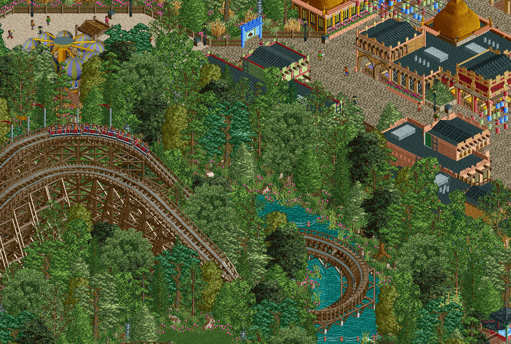
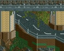
I think my main gripe with the architecture is that it's so loaded with objects at the moment. It seems like every wall has poles, windows, and/or trim on it; I'd suggest letting it breathe a bit more by not needing to put windows on every wall or needing poles for everything. For a park like this especially, I could see them going with "theme" by just doing some messy stucco in places to look like mud walls. In addition to that, maybe adding a couple places of roundness, like rounded corners on walls or rounded towers/parapets, could make the architecture feel a bit more "natural" in a sense that the park did concrete work to make it appear as if the buildings are made of mud.
Yea, I'm not going to say the architecture is amazing. To be honest I probably got a bit lazy here with the forms. But it wasn't really trying to be authentic as I've said. In the end I'm happy with the final product and its serviceable at worst.
The park's been submitted anyways, and I don't think I have inspiration to re-do it all for what would probably be a marginal improvement.
Finished and submitted already? Holy shit.. good job.
I don't think the architecture is the issue here. I don't mind it. I think the foliage is a bigger issue for me in this screen. Good to see it's submitted, looking forward to checking it out.
That's something to look forward to when I'm back! I'll give it a review when released.
Robbie saying someone used too many objects in their architecture? I don't even know what to believe anymore. My entire life was a lie. I can't go on.
I like the density of the foliage, please keep it that way. Coaster looks lovely but it is really a shame it isn't visible to the guests.
I'm not keen on the archy, doesn't seem very African. I think you can do better.