Screenshot / Bandit & Serengeti Balloon Safaris
-
 28-July 16
-
 G Force's Worlds of Fun
-

 11 of 13
- Views 3,347
- Fans 1
- Comments 27
-
 Description
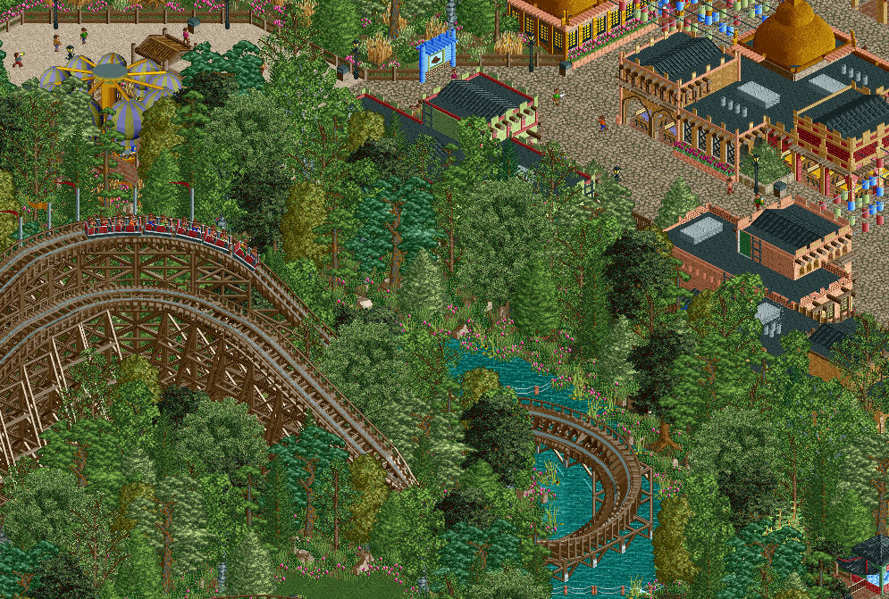
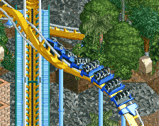
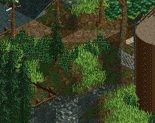
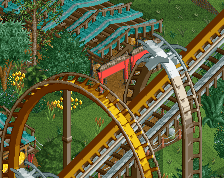
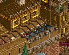
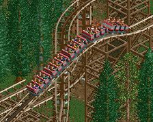
A view of Bandit's speedy river skimming drop and a portion of Africa, featuring Serengeti Balloon Safaris. A Huss spinning balloon ride themed to a adventurous African Safari.
The park is essentially finished, just sitting on it for a bit and cleaning up some objects. As well as finding time to put some sort of readme together. -
 Full-Size
-
1 fan
 Fans of this screenshot
-
 Tags
Tags
Spotlight.
Wait for it.
how dare you spoil the serengeti with roller coasters
I'm so into this. Reminds me of Hercules in a way. Also the dense forest is awesome. Guessing this coaster travels in the forest like The Beast.
This. Deleting some trees will give you some object slots more as well.
I also think the buildings are too packed with objects. Not every empty wall needs a window or wood poles. Especially African architecture is normally tranquil, with a lot of blank walls. And it's another way to save some object space.
The turn looks badass.
I agree with everything above. Getting rid of some trees will clear some object slots, and big chance you won't even notice it too much. Not every tile needs foilage, even in wooded areas. I like the architecture but I agree it doesn't really feel that African. I suggest that you take a look at GeertD his last screen from De Concurrenten, that is some of the best African architecture in RCT IMHO.
Coaster looks sick, and that Serengeti Balloon thing is still cool. I especially love that turn above the water, looks so cool and must be pretty amazing to do in real life. I look forward to seeing this released.
Based on the screenshot you posted in the park updates thread there's a sightline of that turn from a bridge out of frame in the lower left, so no complaints from me.
The ride is primarily inspired by Raven, so I wanted to get a similar density of foliage around this ride. It might be to dense for some peoples liking, but I think it really looks nice and helps the man made aspects of the park stick out a bit more.
I'll look into the African architecture, it was an area I struggled with a bit, especially when it came to detail level and believability. But again, remember its not supposed to be 100% accurate to architecture from the region. Instead its more of a simplified/stereotypical/cartoonish representation of the area.
I like the density of trees. You don't see that too often in RCT. A bit refreshing almost. And whether the African theme is accurate or not, it still looks nice. That red brick building is really good.
I do think the blue sign stands out a bit too much. I guess that's the point, but maybe some less screaming colours would work better.
Also, I don't like the wooden supports here, the ones on top of the hill. I don't know, but I think it would look even better without them. It would be nice if you could make a few tables peepable too.
Looking forward seeing this in-game.
only theflowdiskord can pull of that awful balloon ride...
Nice screen. I like the foliage, especially on the river bank. Archy seems fine to me. I think you need more market/bazaar type detailing rather than those hanging things (lanterns?).
This is a record. only 13 comments.
That balloon ride is great.
I just don't get this. Just because a park is labeled generic or textbook amusement park doesn't mean the the theme has to be so loose and you should just change around wall decorations. They will still typically stylize more than just that.