Screenshot / The other side...
-
 28-July 16
-
 Piano Park
-

 4 of 12
- Views 2,238
- Fans 1
- Comments 14
-
 Description
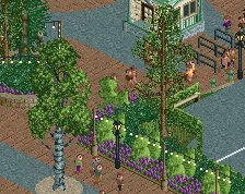
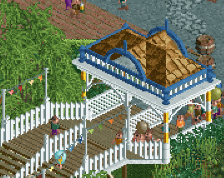
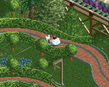
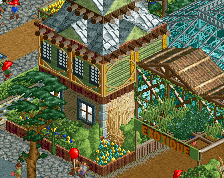
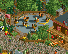
The last screen from the classical zone from Piano Park. Visible are the dark ride Vivaldi's Four Seasons, the tea cups ride Coffee Cantata named after the music piece by Bach and Café La Bohème, named after the famous opera. Also the swinging ship called Dragonetti after the famous double bass virtuoso.
-
 Full-Size
-
1 fan
 Fans of this screenshot
-
 Tags
Tags
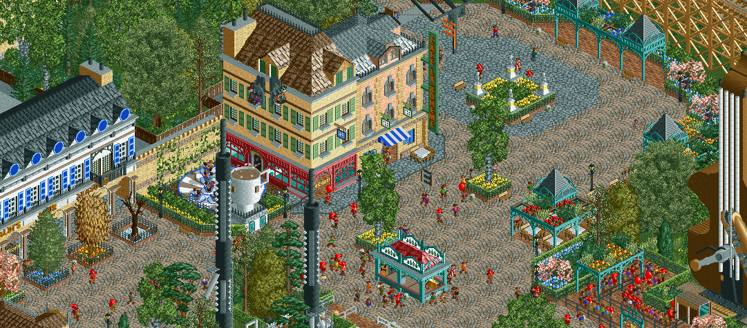
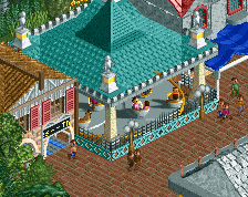
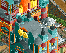
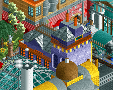
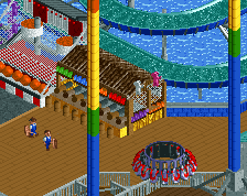
Both the tops of the chimneys and the top of the violin (where the strings are attached) need some additional objects. The transitions are blunt. The rest is nice, especially the coffee cup and the two buildings next to it.
Kind of funny that the classical area is filled with intense rides. Would have expected different.
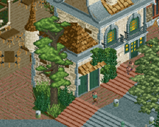
I like the four seasons idea a lot, only I would use different trees for summer and fall.
Beethoven has never been blind. He was deaf, and not due to booze.
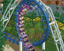
The area has a GCI called Fortissimo, a inverted swinging ship, a slingshot. Those are the intense rides. Next to those are the tea (coffee) cups, two dark rides and a boat ride called Swan Lake. With canoes obviously Seems pretty balanced out to me
Classical music in general and Beethoven in particular can be very intense, so I find intense rides to be quite fitting! Actually quite an underrated theme, not least in the real world!
I agree with Sulakkes critiques about the chimneys and the double bass' head, but other than that I find this very atmospheric and immersive, really nice work from you and so far it seems this park will be another triumph after Easkerton Towers (which I also really liked). Keep up the good work!
Thank you! But they're not chimneys, they're clarinets I'll try to make it more clear.
But aren't there chimneys on the buildings? I figured those were the ones Sulakke was talking about... It's the ones I mean anyway!
Also the clarinets look more like oboes with those thin mouthpieces!
This is good. I love the yellow/peach building, and the custom tea cup is great. Clarinets are still so good!
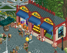
Maybe it's just me but I find the exit hut a bit distracting.
Also I would probably move the 4 season trees one tile further out from the building.
Very atmospheric. Lovely.
@G Force: I've actually already taken lots of inspiration from Liam while making this zone, doing my best not to just rip off from Budapleasure. But I'll take another look at the roofs, see if I can learn something from his. Glad you like it, thanks!
@Lagom: I didn't remove the entrance hut since it's inside and less visible... I doubt I'll remove it, but I will try to make it less obvious and take another look at the trees, as also suggested by Faas. Happy you like the clarinets, probably one of my weirder ideas!
Thank you everyone for the feedback! Hope I can show you guys more soon as I move on to the next zones....
Love the different trees in front of Four Seasons, really great detail. Fun area with a lot of thought .
Loving the building to the far left.
Brimming with charm and atmosphere.
Thank you all! @Poke: atmosphere is my middle name! In my opinion, atmosphere is what makes or breaks a park for me. If I can't get sucked into it, than it's shit, to say it bluntly
I can't wait to start on the next zone!