Screenshot / I made something
-
 16-July 16
- Views 4,548
- Fans 5
- Comments 28
-
 Description
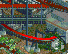
I actually wanted to keep this one under the wraps as long as possible, but I've kind of hit a wall with it, despite being very confident thatI'd actually finally get a project done and release it here on NE. I have two problems:
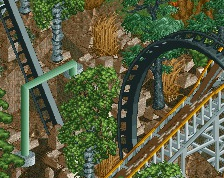
1. This thing is a bitch to support, and I am in dire need of an object that doesn't exist. If you feel inclined to help me: http://www.nedesigns.com/topic/32832/diagonal-slanted-support/
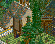
2. I'm not happy with the layout (everything below the beginning of the lifthill.) Not so much an issue with the flow, it is more about the station area not turning out as I intended it to be.
But aside from that I've been having a blast building this. When (or rather if, knowing myself) its done, it will look great. -
 Full-Size
-
5 fans
 Fans of this screenshot
-
 Tags
Tags
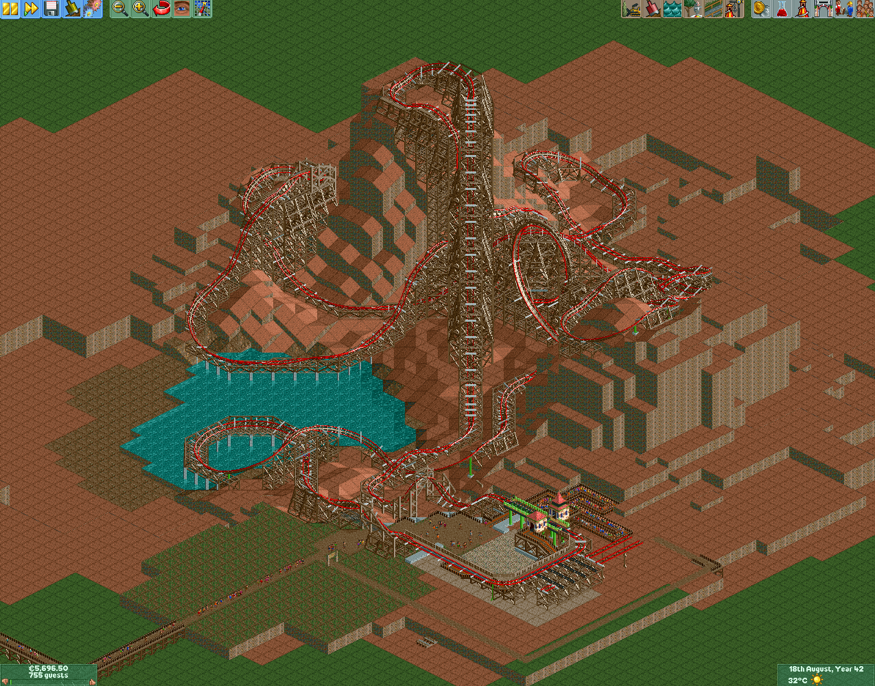
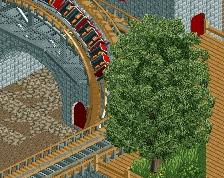
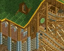
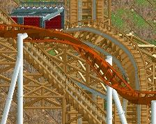
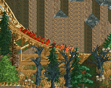
I think the layout looks really nice, supports are a bit messy but that's probably just going to be how it is when your using those type of supports. With some good foliage and surroundings this could easily be design worthy.
I agree with G Force on the foliage and surroundings part. I really love this to be honest!
Thanks for the feedback. Got another shot from a different angle.
As you can see the supports for the coaster are pretty much done, except those turns, That's where I will need the object.
Love it! And I appreciate that you shared the whole layout! That's not really something people do these days.

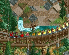
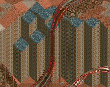
The terrain looks very far up my alley and the supports and track are a very cool solution to the problem of implementing a RMC in RCT2.
YAY!!! someone wants to copy me!!!!
Edit: supports to be clear. not the track.
UGGH! So jelly
Yeah the supports are heavily borrowed from The Joker. I think it is the best execution of them, and I'm not terribly imaginative or patient. I hope you don't mind.
I did some minor adjustments for corkscrews though, I hope they turned out fine, since I cannot find too many decent reference pictures.
That looks dope. Have you tried placing the grey metal beams every half tile? Might help integrate the track with the supports a little more.
This is absolutely phenomenal.
I can't actually believe it.
Best RMC layout we've seen, hell, best RCT layout we've seen, and it's so natural and unforced.
Congratulations, this is a masterpiece.
Looks spectacular. The layout is amazing. If I were you, and if this is meant to be a design, I would try to support all of it with custom supports. A lot of work, but I think it's worth it.
Looking forward to seeing more of this.
Yes I did, but I haven't figured out yet how to make it look good. X7123M3-256 has somehow managed to place the trims in a way that they align more or less correctly, but I have no idea how.
Gee, thanks Louis, I am flattered. I don't exactly think it is the best thing out there, but I put a lot of patience and time in it, so I'm glad that people like it. Sadly the pacing isn't that great. It crawls a lot when it is empty, and the pacing is brutal at full load. I put in a trim brake, but it didn't help much. And I wouldn't even call it unforced, I had a very strict concept of what the layout should contain, so it was a matter of bending the layout to my will in order to let the train make the course.
Hmm, I could try that, I just have to figure out how. And I do actually quite like the look of the supports right now, it gives the coaster a lot of presence, because it is so massive. If I do custom supports you better hand me that design award.
The trim pieces will often draw in the wrong order so it's easy to lose track of where they actually are - they can appear above the track when they're actually below. Enabling "height marks on track" helps, and if you go into construction mode it will highlight the tile that the current track piece occupies.
If the tie is in the right place but drawing incorrectly, the first thing to try is to swap the track around with the tie in the tile inspector (move the scenery not the track - if there's a merge on that tile and you move the track then the merge might break). This will sometimes force the scenery to be drawn first. If it doesn't, I just lower the piece until it does, and if it has to be lowered so far that it doesn't align with the track then I remove that piece.
Also, if you have a piece placed on the edge of a tile, you can move it to the opposing edge of the adjacent tile. Visually it's barely moved, but it's now on a different tile - you want to place pieces on the tile with the higher track piece, if you can.
Sometimes it's necessary to remove a tie and leave a gap, and sometimes it's impossible to make the ties draw correctly from all angles and you have to have some that don't look right.
Thanks for the help.
Which trims do you use for which purpose?
I went with RCT fans trim 1 for slopes (I place them on the same height as the support structure on the higher tile as you advised.
And for flat track (or the top of a hill) I use trim 2.
Looks like an awesome start. The RMC feeling is definately there. Just watch out when theming/landscaping that you don't overload it, making it too busy.
RCT2 owned you. Learn from it. Looks nice though.
That layout is phenomenal. It's extremely RMC-esque, with the exception of the big loop to start (but that's ok because they add new things to their coasters all the time and I could imagine them doing something like that down the road).
I use the objects found in the "Xtreme97 - Deco Ornaments 2014" scenery group, because it's easier than selecting objects individually. I don't stick to a specific object for a specific purpose, I use whatever looks the best at that point in the track. There are two versions of the horizontal bar, and they have slightly different alignment - both are useful, and sometimes I use a full-tile short wall section instead.
rmc is bae