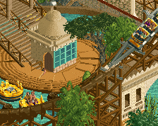
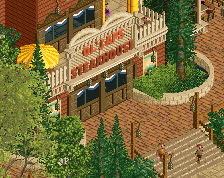
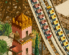
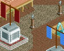
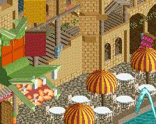
Screenshot / Castle of King Samson
-
 30-September 13
-
 Plopsa Brittanica
-
 1 of 19
- Views 2,090
- Fans 1
- Comments 5
-
 Description
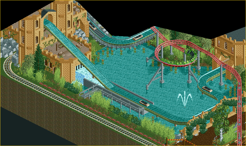
A quiet boat trip around King Samson's Castle in a Medieval tree trunk takes a surprising turn when you suddenly find yourself in a rapid! The Tree Trunks are dragged along into a fierce waterfall and let you tumble meters deep down! As long as it’s dry … euh ... allright!
-
 Full-Size
-
1 fan
 Fans of this screenshot
-
 Tags
Tags
Congratulations on being the first person to upload a screen to the new site
i tried to add one first but I kept getting errors
now I will be forever deprived of my title
Do I have to post a comment now, saying "first"? Adding the other screens of PB soon
I think this area is very well designed, good job! Some colour splashes (not literally) and a couple of high trees along the map's edge would enhance this area even further.
It's well organized and I like all the interactions happening. The only detail that doesn't work for me is the bushes. They're too thick.