Screenshot / Life in Budapest
-
 29-May 16
-
 Budapleasure
-

 6 of 9
- Views 4,348
- Fans 4
- Comments 32
-
 Description
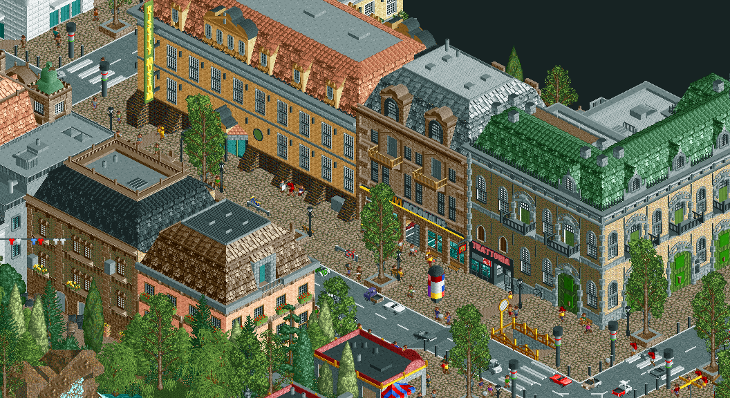
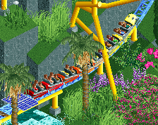
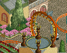
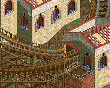
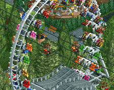
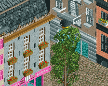
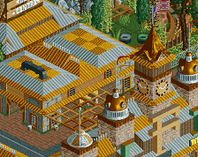
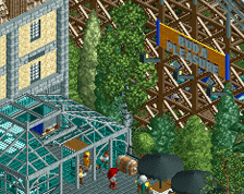
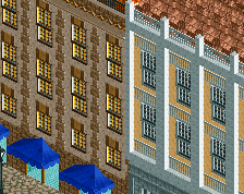
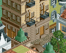
You're not going to Budapest just to ride roller coasters, of course you want to experience some Hungarian culture as well. Luckily the McDonald's is right next door! And a traditional Italian pizzeria.
Did you know that the inhabitants of Hungary are called "Hungry people"? -
 Full-Size
-
4 fans
 Fans of this screenshot
-
 Tags
Tags
lovely. No #Sexshop?
Austin, sex shop is outside the frame. I can erect a second shop if you want.
The traffic lights on the right look a little bit tall and they're one clearance taller than the ones on the left for sure. And the sign should say 'Kiscelli Múzeum', right? The atmoshpere is fantastic. Always love RCT cities with peeps.
I love the big green doors.
Heh...erect.
Great stuff Liam, the green-roofed corner building is real good. Agree with Sulakke, the traffic lights seem to use different objects.
Wow liampie this is some real classy stuff
The shirts hung up to dry are a brilliant detail.
EDIT: Soo, is this a full non-park or can we expect a hungarian tivoli? I spy some suspicious rocks in the lower left corner.
you've convinced me liam, though to be fair the one thing that does the most for me in this screen is that clothesline.
Always good to see you devote to architecture though.
The use of texture is fantastic.
@Live on earths ass: I've been advertising this forever, so you should know there's park stuff too. Even posted a park screen a few days ago! Setting is definitely Tivoli-esque, park itself is more Bakken than Tivoli. And of course this is Hungary, not Denmark, so not everything is picture perfect.
@Shotguns: I was hoping the McDonald's sign would be the highlight of this screen, but I'll take it
@Posix: over-inspired; that's a new term for me. Care to elaborate?
Thanks everyone!
Is the sign a new object?
/\/\?
Oh, I thought the M-sign was custom made. Damn that's creative.
This screen makes me want to visit Budapest right now. Lovely work! Very pretty.
Are those cars moving?
Oh, btw, I don't really get those zebra crossings. Is there a reason why you guys use wooden planks instead of the flat roof texture?
you're so fucking judgemental, i swear liam