Screenshot / Cannon Bowl!
-
 22-May 16
-
 Splashdown Water Park
-

 2 of 3
- Views 3,032
- Fans 2
- Comments 14
-
 Description
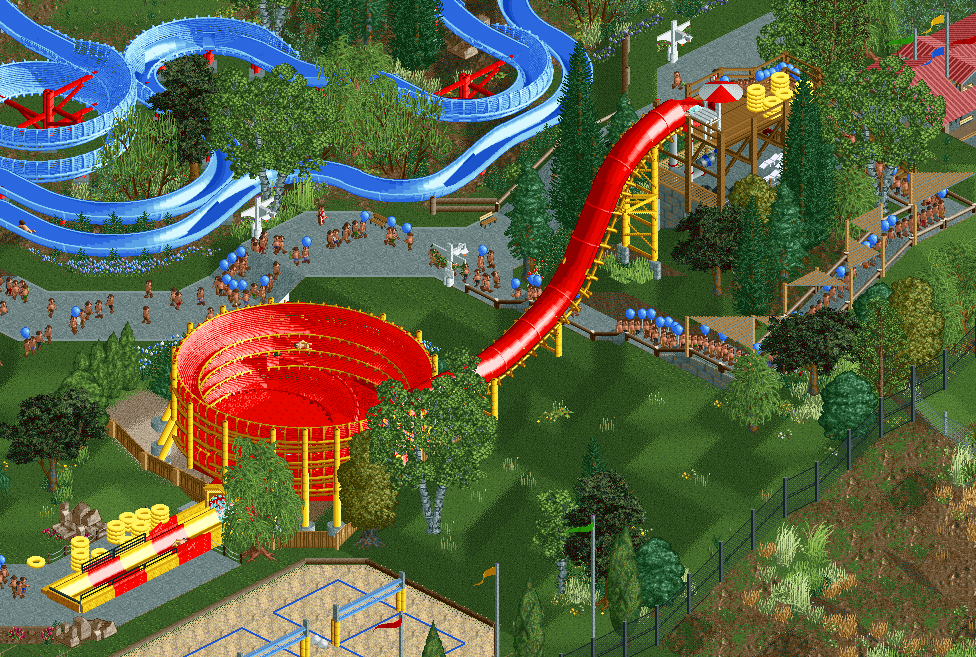
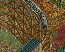
Added in 2005, Cannon Bowl was the first part of our expansion effort, allowing us to once again compete with the regions other water parks, including Boulder Beach at Silverwood, and Wild Waters in Couer d' Alene.
Riders on tubes are catapulted into a large bowl, making several revolutions before being flushed out through a fountain guaranteed to get you soaked! -
 Full-Size
-
2 fans
 Fans of this screenshot
-
 Tags
Tags
To many peeps, for a water park I dont think it this number of peeps helps the aesthetic at all.
Kind of feel everything is just a bit to minimal, foliage, details, everything just feels like 80% of what it could be.
Even though this is much more finished than Costa del Maya, and much larger. I kind of liked that more, the rides and concept were much more interesting than just a standard water park without any real identity.
It's a shame those bowls never look 100% perfect, but this is pretty good. It would be nice if it sloped under at the bottom but whatever.
The exposed ground near the queue needs a wall or something there for supporting the earth.
I disagree with G Force here. Love the peeps in uniform, and I think the plain grass and foliage are quite representative of the waterparks I've been to. The colors are great, too. I second Psi on putting some kind of retaining wall there.
You're nailing the aesthetic, I've always wanted to do a waterpark like this. Can't wait to see more.
It's physically impossible to have too many peeps.
Great stuff BTW!
I agree with G-Force in that Costa del Maya is better! I wish you guys would finish it, it has so much potential! Would have probably been in my Top 5 for H2H7 if it was finished...
This is good too, just different. Not as much my taste.
The peeps are fine, its not like you can't change that if you release this lol, thats literally the dumbest thing to complain about. Anyway I am happy someone is finally making a RCT2 water park that doesn't look like shit.
Probably my most anticipated thing that's actively being worked on.
The landscaping adds to the scale factor, as does the overlaying of slides and path, and the fact that the slides start much higher than the trees, even if they technically aren't much taller.
You know G-Force likes to rant lol its all good.
I think the 1K ruins would look better scattered, in stead of stacked. And something about the grass field is off. I guess it's the swamp plants object or perhaps the flowers. Maybe the complete field would look better when it is mowed by handymen, but I'm not sure. Rest of the screen is very nice.
lmao ^
Maybe it's just a hot day.
Nice. I like how you've used the heartline track as a continuation of the yellow detailing from the bobsled track.