Screenshot / The Lost Kingdom
-
 22-May 16
- Views 2,351
- Fans 0
- Comments 8
-
 Description
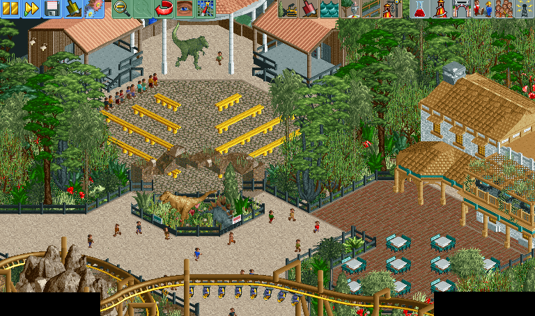
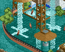
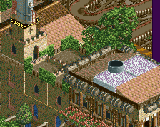
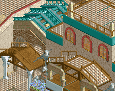
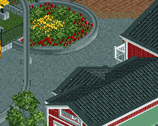
Just started a new project called The Lost Kingdom. It's inspired by the new themed area at Paultons Park in the UK. It includes two coasters, a Vekoma family boomerang and a Vekoma family suspended coaster.
In the screen you can see the park's show, Dinosaurs Live! Guests can get a bite to eat at the Jurassic Café, and then take a ride on Flight of The Pterosaur. -
 Full-Size
-
 No fans of this screenshot
-
 Tags
Tags
Nice work!
Reminds me a lot of Extinction. A little too much even. Its nicely made though, path could use some bins and benches, super stale now.
Great stuff! But G Force's got a point. Be careful that it doesn't end up a complete ripoff...
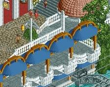
It looks very nice. The one thing that currently looks awkward to me is the archway at the entrance to the theater area. Besides that it looks great
Really cool. I agree with G Force about the path though.
Thanks for the comment. Funny thing is I didn't even look at Extinction when making this. I'll look at it now to make sure it's not completely copied lol. As for the paths I'll definitely spice them up.
Can't really help similarities given the theme imo.
Looks pretty good actually, but you need to definitely clean up the archway and should also probably add some lower-level foliage (that isn't bushes/flowers).