Make a splash coaster called soundwave and a boomerang fwd/rwd :-)
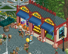
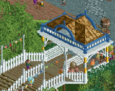
Really liking this, just add to the path instead of making it less open, add frozen staff like entrance photographers and stuff like that, queues to go on a picture with an entertainer... Realistic for a park and something we don't see that often, we make parks but tend to forget stuff that you experience beyond the rides in a park... You have the room for this so mught aswell use it?
I like this better than the first screen. I still want to give you feedback on that, but I guess that all my criticisms for this screen also apply to the other.
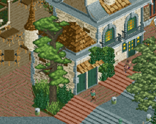
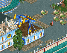
- I like the music ornaments on the paths, but all the other path patterns take away from it. Especially the one in front of the entrance is a mess because of that. I think path sculptures should generally have a single background texture with some margins on the sides. You have two background textures and no margins. - The music note ornament is not visible for the peeps from the angle you're supposed to see it, because there is a tree right in front of it. Don't centre your trees! Place them along the sides. Same for the (awesome) sculpture, carve out a nice place for it along the side of the path; either on the waterfront or to the left of the top left building. - The lighthouse bit seems random. My only complaint about the archy, because otherwise this is pretty damn atmospheric and definitely your best stuff yet. - Aside from the sculpture and the path tricks, what makes this a music park? It's relativel generic. I think you'll have to be more creative to make a theme like this work. It's definitely a very hard theme, so I'm not saying it easy... Something that comes to mind is to get rid of all the path stuff you made, and instead make a winding curvy stave with notes and musical symbols that lead the guests from the entrance further into the park (a hub?), and to give the area a visual sense of direction.
 22-May 16
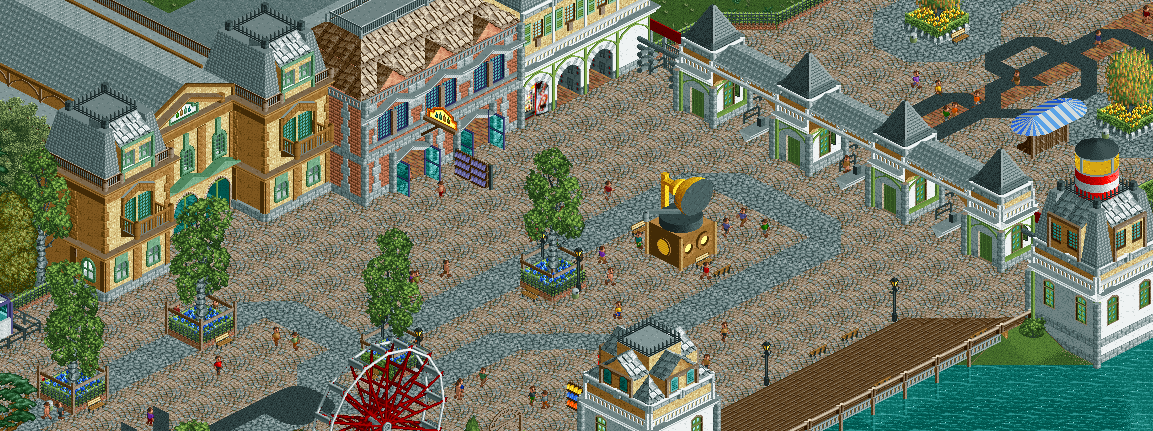
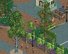
To much path, architecture is an improvement though. Would like to see more elaborate theming, kind of seems a bit sparse.
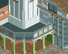
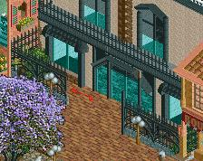
I really like the tan building.
Nice treble cleff and gramaphone. Agree that there's too much path. Surely the entrance itself could be much grander.
Really liking this, just add to the path instead of making it less open, add frozen staff like entrance photographers and stuff like that, queues to go on a picture with an entertainer... Realistic for a park and something we don't see that often, we make parks but tend to forget stuff that you experience beyond the rides in a park... You have the room for this so mught aswell use it?
Good idea! Thanks for that! I was wary about making the path smaller so I'll add some extra features to make it more interesting.
You should also make a big piano were you can step on and you can play a song by jumping around. And musical fountains.
Thanks, Faas! I'm taking notes...
- I like the music ornaments on the paths, but all the other path patterns take away from it. Especially the one in front of the entrance is a mess because of that. I think path sculptures should generally have a single background texture with some margins on the sides. You have two background textures and no margins.
- The music note ornament is not visible for the peeps from the angle you're supposed to see it, because there is a tree right in front of it. Don't centre your trees! Place them along the sides. Same for the (awesome) sculpture, carve out a nice place for it along the side of the path; either on the waterfront or to the left of the top left building.
- The lighthouse bit seems random. My only complaint about the archy, because otherwise this is pretty damn atmospheric and definitely your best stuff yet.
- Aside from the sculpture and the path tricks, what makes this a music park? It's relativel generic. I think you'll have to be more creative to make a theme like this work. It's definitely a very hard theme, so I'm not saying it easy... Something that comes to mind is to get rid of all the path stuff you made, and instead make a winding curvy stave with notes and musical symbols that lead the guests from the entrance further into the park (a hub?), and to give the area a visual sense of direction.
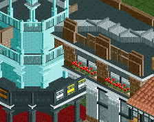
Great architecture! I agree with all Liam's points.
if you made a better entrance, this would look so much better. that megaphone thing is dope asf though