Screenshot / Astroland @ Asbury Park
-
 09-May 16
-
 Astroland @ Asbury Park
-

 4 of 4
- Views 1,765
- Fans 0
- Comments 6
-
 Description
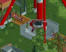
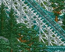
Third times the charm. Very early in construction. Going for an Americana style trolley park. Looking for as much constructive criticism and helpful tips as possible. Still trying to get a good feel for scenery, I've had moderate success. Roof on the right is unfinished, just started the first main street building in the upper left. Need to add more color variety and probably spruce up the carousel. Anything I missed?
-
 Full-Size
-
 No fans of this screenshot
-
 Tags
Tags
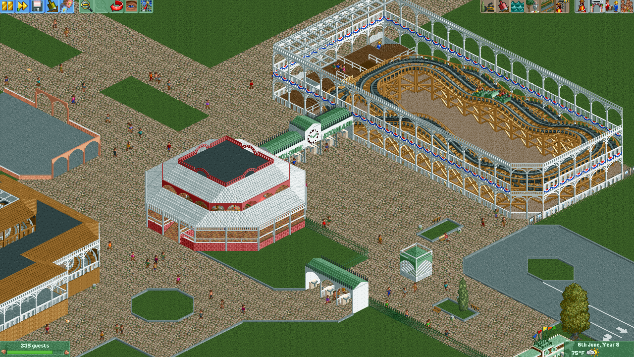
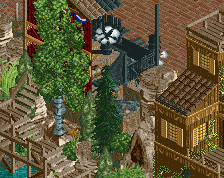
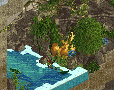
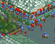
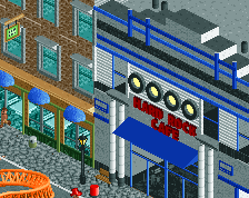
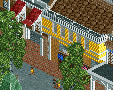
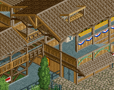
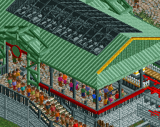
Its an improvement, try to integrate more objects outside of just walls though, everything looks a bit flat now. Also more finish would be nice.
looking at real life building structures gives you better building ideas too.
I don't see why you used the side-friction cars but not that style of track? I think that would've been a more appropriate choice. Other than that it's got potential but it's so unfinished it's hard to say something really. Regarding architecture, what's there is a little flat, plain, and could probably do with some more details. Those turnstiles are a nice touch though, and a good start, detail-wise!
Okay, but that's my biggest problem. What do you guys mean by more details, like what in particular?
such as this for example
http://www.nedesigns...ot/2889/suttle/
http://www.nedesigns...ardwalk-arcade/
adding detail to basic things makes stuff pop out more.
They key is to work on texture of the facades. You're off to a good start, detail-wise, using the Fisherman arches etc, but when just stacking wall objects it gives a kind of flat, "2D", impression. Even a building with a simple, square plan can gain a lot of life from careful choice of wall textures and detailing. Since realism seems to be what you're going for, study the great parks in that style here at the site, chemist suggestions are good, also have a look at some of the recently posted screens here, in particular the one by robbie92 (it doesn't always have to be that detailed to look good, but it gives a good idea of what sorts of details I'm talking about)