Screenshot / Jazzland - Court of the Jester
-
 07-May 16
-
 Jazzland
-

 3 of 8
- Views 3,286
- Fans 7
- Comments 19
-
 Description
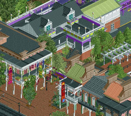
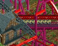
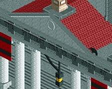
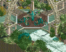
Wander off Rue Royale and you may hear some mischievious laughter guide you into the Court of the Jester, where beads hang from every surface imaginable. Be wary, though, as playing into the Jester's tricks could send you on quite a wild ride...
-
 Full-Size
-
7 fans
 Fans of this screenshot
-
 Tags
Tags
Great archy, as we can expect from you. Screen has great atmosphere too, the busyness fits the theme.
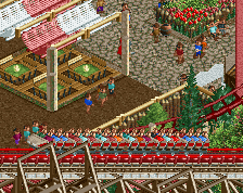
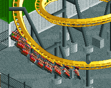
The street looks amazing. The station is poor in comparison. It's obvious there's a pretty big time difference between when you built them.
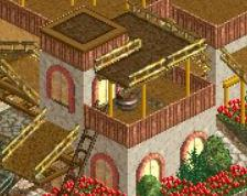
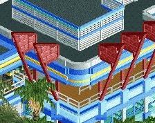
Great atmosphere ! (As I'm rebuilding a newer version of Pinehills) I found we're using the same kind of objects for the same purposes. When building most of the first few buildings in the new park I was hoping it wouldn't come to this but well the roofs of the two lower buildings on this screen are quite similar to those in my park. For me it's not a problem and our parks are very different from each others so I can't be bothered, but before people start to speak about copying Nope, it's just that the better builders in this game are using the same kind of objects in building their parks.
Keep up the good work Robb!
For me it's more problematic as I'm building a New Orleans/Music theme in my next park as well... But I'm sure our interpretations will be different. Great work!
I'm with itm, It looks too complex for me.
The buildings look amazing, if not a bit busy, but the station is way to plain in contrast. I'd suggest you ty to find a balance. But it really radiates the NOLA charme, I'll give it that.
Robbie is trying to reach new levels with this screenshot, alot of detail and textures. I like it, I can see myself following down this path later on...lol
Everything is perfect. Don't change a damn thing.
Nah I'm definatly overloaded here with this to. I think the foliage is really the issue. Maybe it's because of BGA but I'm getting a weird asian nola vibe here and I dont quite like it.
Is this the first time Pacificoaster has posted in months or am I hallucinating?
Thanks for the feedback, guys. As far as foliage goes, this screen is a bit deceiving in a way in that it crops off right where the foliage ends, so a lot of the open spaces or calmer spots in the landscaping are just out of screen; I'd say that it looks like it has more breathing room in-game. However, the architecture is around the level of business that I was aiming for, which was a hyper-real version of the French Quarter, a bit more colourful, a bit more vibrant, and a bit more exaggerated than the real thing. As far as the station goes, I want it a bit less busy than the main street, though I think maybe something like updating the floor pattern could go a long way in making the station feel more texturally in-line with the rest of the screen.
I really like it. The foliage is amazingly lush and inviting, considering how much there is in the screen. The exposure of the buildings is good too. It invites to explore rather than overwhelm you.
Incredible...
Architecture is outstanding though.
I don't mind the plain-ness of the station, it's not really a focal point of the area anyway is it? But changing the floor texture seems like a good idea. In general though I'll have to agree with Pacificoaster, it's perfect!
love you boo