The second, definitely. It adds so much more contrast and allows everything to pop. Everything blends together in the first.
Again, I'm pretty excited to see where you take this park. I'm always a bigger fan of 'original' Disney parks as opposed to traditional DL/MK-style parks.
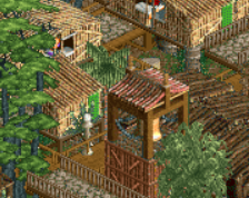
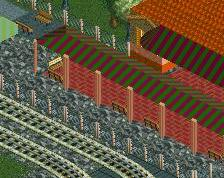
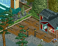
I like the right also, but regardless, I'd like to see the tram bridge a little higher. The scale of this area is either really small or off entirely, ahah.
the tram bridge is now gone from this part of the park and redesigned (as well as raised), and the flow of everything is much improved. So thanks for the tips guys
I also like the left one more . The right one has to much contrast for me and I don't like how the light brown path near the house sticks out so much. In the left one the transition is more gradually which I like.
The right is much better but it requires that you rework the stone (?) before the red kicks in. In fact, I'd first try taking it out completely. It looks superfluous.
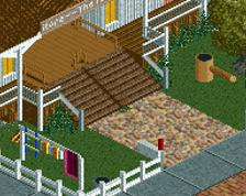
I like the left one better. I feel like the lighter path matches better with the brick and light tan flooring of the building. But that railway. I LOVE it, and I may steal it.............
I agree, and right now it's detrimenting both versions. It offers nothing to the pathing, really.
The right is much better but it requires that you rework the stone (?) before the red kicks in. In fact, I'd first try taking it out completely. It looks superfluous.
I actually think the stone is well-implemented. It does well, breaking up the building.
been trying to find time to work in among studying. what color of path fits better? the area is an outpost/african sort of area, like you might find at animal kingdom
 18-October 13
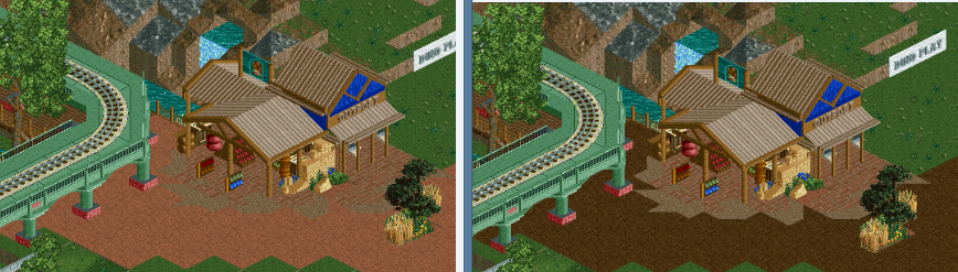
The second, definitely. It adds so much more contrast and allows everything to pop. Everything blends together in the first.
Again, I'm pretty excited to see where you take this park. I'm always a bigger fan of 'original' Disney parks as opposed to traditional DL/MK-style parks.
RMM Offline
definitely the right. the left looked washed out.
I like the right also, but regardless, I'd like to see the tram bridge a little higher. The scale of this area is either really small or off entirely, ahah.
Agree the tram bridge is the weak link here. It's just not nearly as good as it oughta be.
the tram bridge is now gone from this part of the park and redesigned (as well as raised), and the flow of everything is much improved. So thanks for the tips guys
noooo the left one it's softer
I agree with turtle, the left one is soooo much better and atmospheric. It really has that African savannah kinda feel to it.
Great work though cocoa, keep it up!
The right one fits better. The left one gives me an Australian feeling
I also like the left one more . The right one has to much contrast for me and I don't like how the light brown path near the house sticks out so much. In the left one the transition is more gradually which I like.
The right is much better but it requires that you rework the stone (?) before the red kicks in. In fact, I'd first try taking it out completely. It looks superfluous.
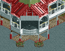
The flat roof pieces are overkill imo.
I like the left one better. I feel like the lighter path matches better with the brick and light tan flooring of the building. But that railway. I LOVE it, and I may steal it.............
I agree, and right now it's detrimenting both versions. It offers nothing to the pathing, really.
I actually think the stone is well-implemented. It does well, breaking up the building.
The right path could work, but only if you change the interior paths. The dark brown clashes too much with the light brown and bricks.