Screenshot / Járnviðr Station
-
 26-April 16
- Views 2,377
- Fans 0
- Comments 11
-
 Description
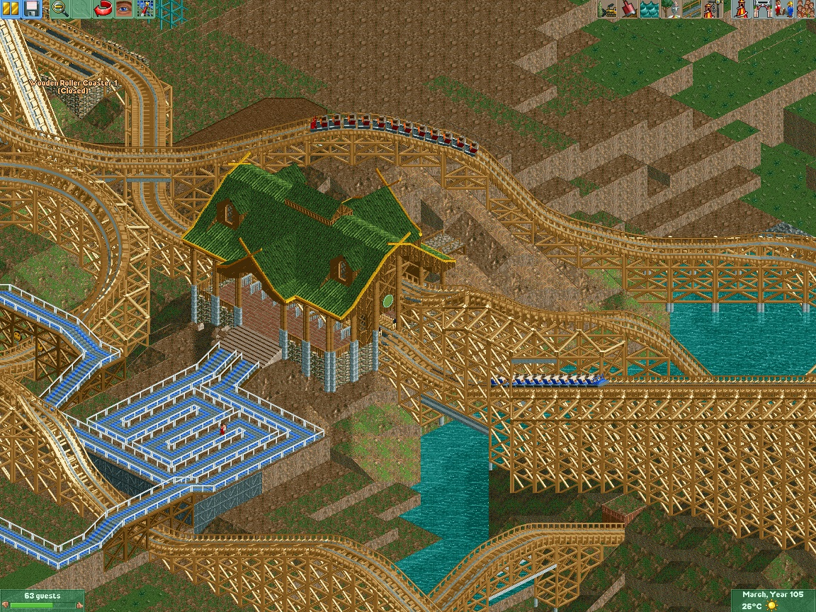
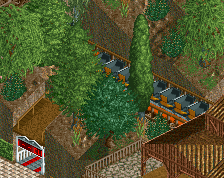
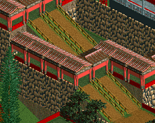
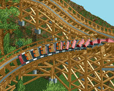
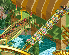
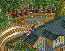
Architecture has always been one of my greatest weaknesses, so I'd like to get a feedback for my first attempt at scandinavian architecture, the station for Járnviðr, my 6600 ft long Terrain GCI. I kow, there isn't much to comment besides NEEDS MOAR FINISH, but I'd like to know if what I've built looks decent, before I build more of it.
-
 Full-Size
-
 No fans of this screenshot
-
 Tags
Tags
RMM Offline
very nice so far. the landscaping is key.
maybe find a way to 'desquare' the queue a bit to allow the overall flow to continue.
Thanks. The queue is not final, I'm trying out different layouts. Not really happy with this one either.
The right hand path is actually a fast pass queue, the layout there is not final as well.
This is the other side with the exit. I'd like to make a small tunnel and a giftshop builing that is sunk into the hill facing the brown footpath.
This green roof is very unsightly in my opinion. It also will not work with dense scandinavian foliage, if you're planning to do something like this, because it cannot stand out with that color.
Otherwise pretty good station. It could be a little bit more decorated here and there but you can pretty well establish on this in my opinion.
Looks good. If you can, I'd just try and make the station a touch smaller. See if you can find a way of whittling it down by a 1/4 tile on each side.
I don't think big squares of queue look good like this either, I try to mix switchbacks with looser, more natural lines.
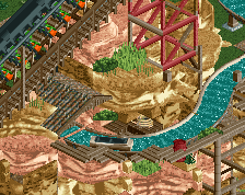
That waterfall interaction is gonna look great!
I was trying to emulate the serpentine queues that are used in some parks, without success, I must admit. As for the roof color, I've seen it being used in several scandinavian parks. I'm not quite sure how I'll do the foliage (depends on whether I will turn this into a park or design), but for now I'll keep it as it is. As for the roof, I'll try to cut off the two overhangs facing the lifthill and brake run, and the two covering the steps, but aside from those the roof occupies the footprint of the building itself (I suppose it looks bigger than it is due to the somewhat thin poles supporting the roof, but I'm not sure how I could make them look better).
I really like what you have so far. I'd encourage you to try to really make this your own and work hard to keep it different from Ragnarok. No matter what, they will be compared to each other I'm sure.
Thus far the queue is the weakest part. Not just judging what is there, but what will be. I would encourage you to play with the queue more. Coaster interaction, weave about through artifacts, foliage, or scenery. Serpentine queues are fine and very common but use them sparingly.
It is good that you brought this up. I am not going to lie, I borrowed a lot from Park Edda, especially the interaction with and the supports of the Water Coaster (although mine's going to be bigger).
I was never the biggest fan of Ragnaroks layout. so I made that one pretty much my own, so what my project and Park Edda are sharing are the scandinavian theme, the station flyby, the interaction and watercoaster. I don't know if that falls under outright stealing or merely a homage.
I'm very tempted, since it is probably my favorite execution of scandinavian theming, and like I said, architecture was never my strong point. At the end, I hope it can set it itself apart due to its own merits, especially if I turn it into a full park (thinking about a mid-sized Nemesis style B&M invert and a Intamin Rocket Coaster).
needs moar finish
Scandinavian finish?
Thank you. Somebody had to do it.
I really hope this can be considered an improvement (at least layout-wise).