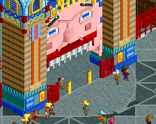
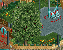
Colors are a bit to saturated, especially that orange and yellow. Path color is a bit weird as well, maybe something a bit more textured and not colored.
I just compared it with pictures of the real ride. Some thoughts:
- I agree with MCI on both points. The supports look too thick. Double B&M supports would do the job. The yellow cover does not work. It's incredible difficult to recreate that shape. I'm not sure if you should even give it try, as the real thing doesn't look good either.
- I'm not sure if the turquoise path works well. The real park has sand coloured path. Not sure if this is a strict recreation or not, but sand coloured path would look better and would resemble the real area.
- I would use single lamps on these lamp posts. The real thing has single ones as well and multiple lamps look unnecessarily messy.
- In comparison with Dreamworld, the foliage seems too dense. A more dessert like foliage would work better here and will save you a lot of time and object slots as well.
That being said, I'm really excited for some more screens. I always love new park recreations.
I started originally with the double B&M supports, but that makes the frame way to cramped. Unless like a 1/2 height B&M support is made, then the frame will either look too thick or simply not wide enough.
Point taken about the pathing, I'm primarily using google earth so the pathing around the ride is still the teal you see in the screen. You're right that it looks better sandy though.
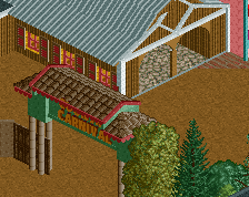
Not a fan of this screen. The flat's proportions look too squat and thick, the orange blob of deco pieces on top and the red footers are really messy and that flat textureless canopy dominates the queue too much.
The color choices are also clashing really badly: teal paths, light tan and blood red base, light blue yellow orange and deep brown architecture / canopies... needs more clarity and cohesion.
Sorry to be harsh here but when just compared to that beautiful cathedral you posted not too long ago, this just seems like a huge step down.
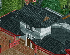
Honestly, what stosky did here was not easy. And the brown road lines are for a more polished look on the paths, Faas. I just think its too many different paths going on. Other than that this is very solid shit stosky! Why not make the que line brown like the exit path??
Themed to look like the prehistoric paw of a 3D rampaging velociraptor, The Claw propels adrenalin junkies nine storeys high, mercilessly swinging them back and forth at 64km per hour while twisting 360 degree full circles.
 26-April 16
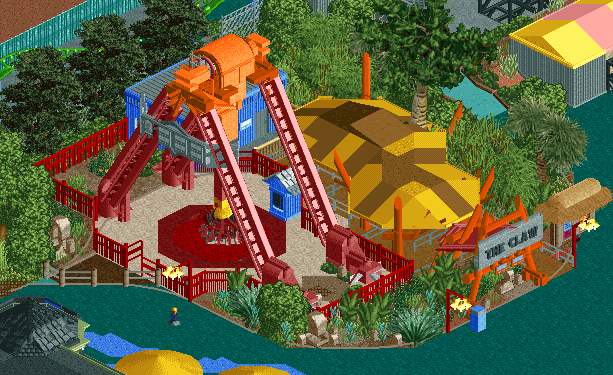
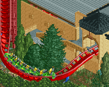
hm, the supports are a little too massive for my liking.
And the roof over the Q looks a bit out of place.
Absolutely spectacular
dont tell me your doing dreamworld, thatd be insane
Colors are a bit to saturated, especially that orange and yellow. Path color is a bit weird as well, maybe something a bit more textured and not colored.
I just compared it with pictures of the real ride. Some thoughts:
- I agree with MCI on both points. The supports look too thick. Double B&M supports would do the job. The yellow cover does not work. It's incredible difficult to recreate that shape. I'm not sure if you should even give it try, as the real thing doesn't look good either.
- I'm not sure if the turquoise path works well. The real park has sand coloured path. Not sure if this is a strict recreation or not, but sand coloured path would look better and would resemble the real area.
- I would use single lamps on these lamp posts. The real thing has single ones as well and multiple lamps look unnecessarily messy.
- In comparison with Dreamworld, the foliage seems too dense. A more dessert like foliage would work better here and will save you a lot of time and object slots as well.
That being said, I'm really excited for some more screens. I always love new park recreations.
I started originally with the double B&M supports, but that makes the frame way to cramped. Unless like a 1/2 height B&M support is made, then the frame will either look too thick or simply not wide enough.
Point taken about the pathing, I'm primarily using google earth so the pathing around the ride is still the teal you see in the screen. You're right that it looks better sandy though.
Maybe you could try the older thick support that for instance egg_head used on his B&M's in Indigo Hills.
Not a fan of this screen. The flat's proportions look too squat and thick, the orange blob of deco pieces on top and the red footers are really messy and that flat textureless canopy dominates the queue too much.
The color choices are also clashing really badly: teal paths, light tan and blood red base, light blue yellow orange and deep brown architecture / canopies... needs more clarity and cohesion.
Sorry to be harsh here but when just compared to that beautiful cathedral you posted not too long ago, this just seems like a huge step down.
I love this.
I love it, the proportions are great and represent the real ride well
And its a little different to every huss swing in rct atm so thats a bonus too, please keep it as is. Its perfect
You've got to be kidding.
The proportions are pretty far off...thickness of beams and mechanical units on top are too large in comparison to the height of the ride...
The color of the disk blends in way too much with the floor.
ooft sorry i was just going from memory, when i was there last it seemed huge
sorry for enjoying some rct
Enjoy it as you will, but saying it's perfect is a little far-fetched and not constructive since there's a lot of room for improvement.
I think it looks fine. However, I don't understand the brown road lines.
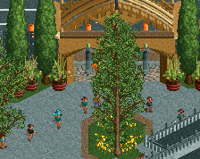
Edit: Foliage looks awesome!
the path color is uncalled for
if it's a recreation I think it is fine.
Honestly, what stosky did here was not easy. And the brown road lines are for a more polished look on the paths, Faas. I just think its too many different paths going on. Other than that this is very solid shit stosky! Why not make the que line brown like the exit path??