Screenshot / ZeFearus
-
 10-April 16
-
 KnoxVegas
-

 8 of 11
- Views 3,471
- Fans 7
- Comments 20
-
 Description
'Folks don't go in them hills often, and when they do they ain't ever comin back...'
More or less have all the landscaping and foliage done around ZeFearus. Might go back and do a bit of touching up once I get closer to release but I am super happy with how it's turned out for now!
Thanks to all who came and watched me stream! -
 Full-Size
-
7 fans
 Fans of this screenshot
-
 Tags
Tags
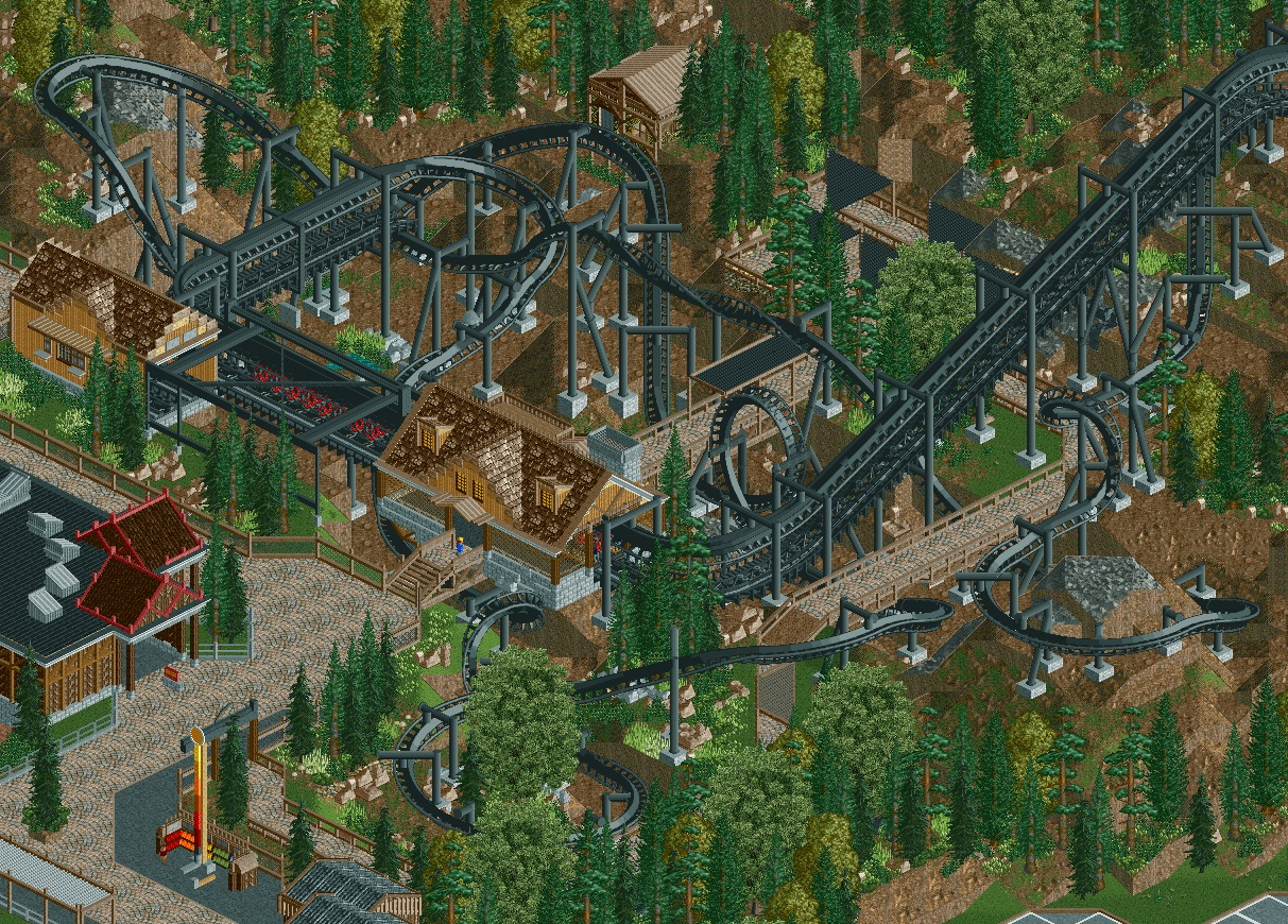
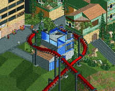
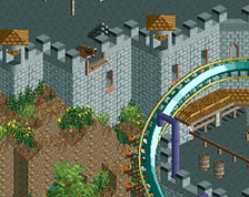
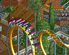
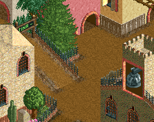
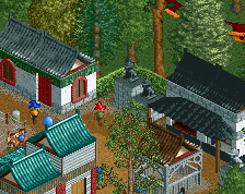
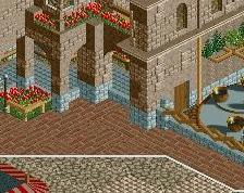
Coaster is nearly perfect as always, landscaping looks great as well. Maybe could use just a little bit more color, possibly starting with the queue awnings. Red could work, just something to give it some more life, its quite dull, especially without peeps.
Wow. That layout is nuts.
Great job on that!
Landscaping around the coaster and the placing of queue line is on point, too.
The building in the bottom left corner needs one colour less, on the other hand. That red trim is disgusting. I guess that whole building could do with a makeover, honestly... The ugly trim is the only thing that makes the building noteworthy.
Not really a design flaw, but something I think could improve: replace that oak tree. Maybe my 2x2 chinese tree, same size and I think the shade might fit the park's foliage well. Something else might work too though.
Lastly: the corsican pines on the bottom left are not rotated!
Great lay-out, as always. The footers stick out badly. Maybe use smaller round footers. And I think you could do a little bit more with the landscaping, like adding dead trees or some swamps (which would add some fresh splashes of blue while still keeping a dark theme). I agree with Liam about the queue covers. I think that as soon as peeps are added to this area it will look fantastic.
Really love the layout. Landscaping looks a little raw in places but that could be because it's not totally finished.
i'd really like to see fewer "square" buildings with triangle roofs. i'd like to see more shape added to spice that up. good work though as always mav.
layout is very well done. Love how twisted it is. The station and surrounding architecture is a bit lacking though.
ooh yeah, purple would look good.
That looks incredible.
I think that, given the scale of the park as a whole, the lack of interesting details in the pit and landscape is forgeivable, you have better things to work on.
Thanks for all the positive feedback guys!
To address some of the critiques now...
The queue covers have been addressed. I'll show them off in my next live stream but I wanted to keep the same basic idea for simple shading of the queue. I understand why a larger cover similar to the station would fit in nicely, but it would sort of ruin the 'isolated' feel I'm going for with the ride, hence why I only have the one abandoned looking building in the 'pit' area of the ride. I do think what I've managed to do fits the theme well and fits the area better than what the old covers were and hopefully you guys feel the same.
As far as color goes, I don't want to add too much into the area and detract from the natural feel the area has now, but with that said I do see where the area could benefit from it. Going to be playing around with flowers and such to give little pops of color without being over-powering so hopefully it turns out well.
Lastly, I do plan to go back and add touches to the landscape once I 'finish' the park, but want to be object conservative just to be safe while I finish up the rest of the park so I have the park consistent landscape detail wise. Along with that I may look into different footers as the square ones have always bugged me, but I don't have the standard quarter-tile round ones in the park for some reason and haven't been bothered to import them lol
Thanks again for the positive comments and critiques everyone, the park is getting close to done and every comments just encourages me to finish this damn thing!
Black inverts still make me think RCTFAN.
Looks nice, path layout is very stiff and tight. Could use some relaxation.
Maybe try the footers used in Raptor, they're square but also a lot smaller.