Screenshot / Silver River City
-
 10-April 16
-
 Fred's Ultimate Coaster Kingdom
-

 33 of 36
- Views 1,740
- Fans 1
- Comments 12
-
 Description
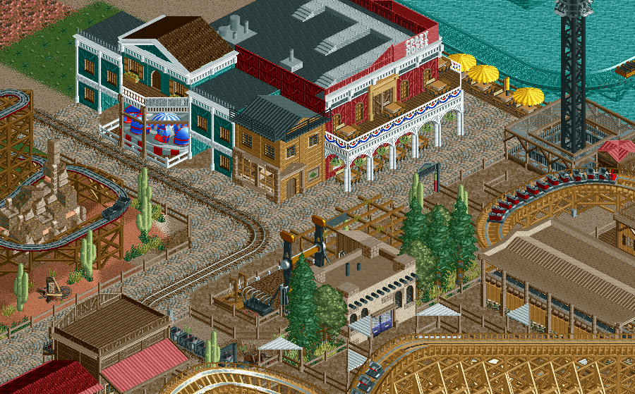
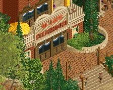
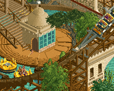
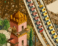
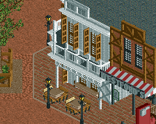
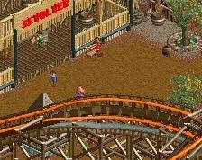
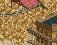
Come and visit or western Silver River City village! Experience the far west in FUCK. The time of bandits, desperados, the time of the goldrush.
Enough of all the excitement?! Come and join a show during dinner in the biggest restaurant of the park: the Crazy Horse Saloon! -
 Full-Size
-
1 fan
 Fans of this screenshot
-
 Tags
Tags


This is really nice. Gives me a bit of a disney/frontierland feel.
Really good stuff. The wooden wild mouse is such an underrated ride, glad to see it here. The restaurant looks great too. The mine train track however makes the place look cluttered though, and the right hand side of the picture looks a bit brown. Apart from that, nice work!
I like the rocks. I feel like that's how tacky fake rocks should look.
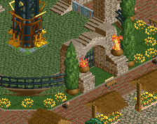
Cocoa pro-tip: make those bannister rails gray, which still appears white, but won't lose shadows and will look a lot better.
Faas, on 10 Apr 2016 - 8:43 PM, said:
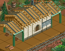
It's the transfer track, station isn't visible on this screen What you don't like about it?
Richie Offline
Hate this path when not broken up, its too much distracts from the screen for me
Everything seems a bit square, maybe try and move some stuff around and add more diagonals and offset structures to give it a more organic feel.
Heh, Crazy Horse is the name of a strip club in Adelaide...
The RCT is quite good though. Not sure I'd go with the cena path here though; brown dirt or off-white could work better in my opinion.
Stoksy, on 11 Apr 2016 - 12:23 AM, said:
same where I live lolhey that is actually something I do. did I tell you that during h2h or something
no, you've said it before a couple times.
FredD, on 10 Apr 2016 - 8:52 PM, said:
It is boring and all the same shade of brown. I also don't like the steel texture. Maybe change the colour of the roof pieces?