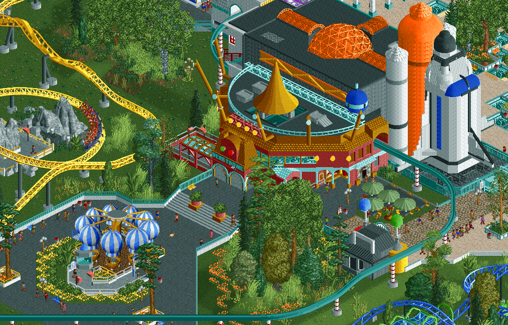
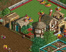
That building is absolutely fantastic. It looks great architecture wise and I also love how the monorail goes through it. Atmosphere is also really nice. I like it .
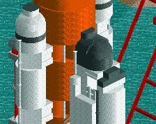
However the Space Shuttle looks a bit fat and deformed which is a shame .
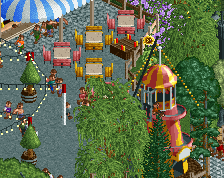
That building really does look awesome. The whole screen is filled with colours and contrast between the dark path and the more vibrant colours of the coaster and buildings. Good work!
Like the building a lot. And the placement of the balloons are also lovely. But as Recurious mentioned, that shuttle need to go on a diet! I think you can do more with the yellow coaster's environment.
Great stuff. Not a fan of the details directly on top of the roof, though. Mostly because from peeps line of sight they would never see them given the height of the building. Removing them could clean things up a bit!
Thanks guys. Just to tackle two things more people mentioned:
- I'm keeping the Space Shuttle like this. I don't mind the bulkiness. I experimented with different shapes and forms but this fits the surroundings the best.
- The 'floating' dome isn't for guests outside the building to see. It's meant to project lights/effects to the inside of the building. You know to really give the experience of an intergalactic flying saucer derby.
You've finally developed your style a bit and it works wonders. I like how you're grouping elements. Very cool to look at. Just way too clean and perfect for me. That diagonal line.....
 07-April 16
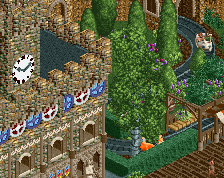
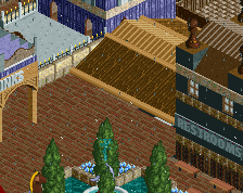
That building is absolutely fantastic. It looks great architecture wise and I also love how the monorail goes through it. Atmosphere is also really nice. I like it .
.
However the Space Shuttle looks a bit fat and deformed which is a shame .
.
That building really does look awesome. The whole screen is filled with colours and contrast between the dark path and the more vibrant colours of the coaster and buildings. Good work!
lovely, you get better and better
Like the building a lot. And the placement of the balloons are also lovely. But as Recurious mentioned, that shuttle need to go on a diet! I think you can do more with the yellow coaster's environment.
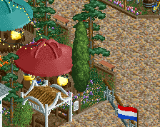
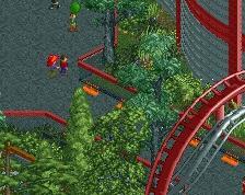
the foliage and colours are amazing!!
fun level = strong.
I like the chubby rocket.
I like it. That floating spire looks strange though.
As always I like the colours.
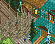
What I like the most is how you can see the Derby Doom through the glass. The little stall next to the bathroom is great too.
Nice stuff.
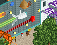
Wonderful theming for the flying saucer ride! Great colours all round too.
Pretty cool looking. Maybe extend the path out one more tile near the Mack coaster so its even on both sides of the Derbydome? Rest is really nice.
Kind of wish the derby dome was its own separate building as opposed to being connected to the theatre(?)
Otherwise, this is pretty great stuff.
Thanks guys. Just to tackle two things more people mentioned:
- I'm keeping the Space Shuttle like this. I don't mind the bulkiness. I experimented with different shapes and forms but this fits the surroundings the best.
- The 'floating' dome isn't for guests outside the building to see. It's meant to project lights/effects to the inside of the building. You know to really give the experience of an intergalactic flying saucer derby.
You've finally developed your style a bit and it works wonders. I like how you're grouping elements. Very cool to look at. Just way too clean and perfect for me. That diagonal line.....
so cute