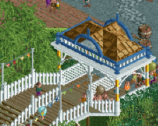
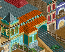
It is a bit hard to focus on each screen separately. Would be nice if you would upload two screens instead of one. In contrast to what it seems most of the comments above, I don't really care a lot about the lower screen. Not entirely sure why. Maybe because of the blue building and the purple building on the left looking pretty simple and meaningless. The upper screen is really nice, though. The restaurant is very good. The planters could use some work. They seems a bit unrefined.
Great stuff, Jappy. Love the Mexican area. The top screen looks nice too. I would probably have the giant ice cream on the wall instead of the path. Anyhow, good job.
There's something I really like about the red 2x2 building in the Mexican area. Might be the arches on top... dunno. But either way, I think it works really well. I think everything here looks great actually. Lovely warmth to the Mexican screen, and the top screen is clean but with plenty of content.
 06-April 16
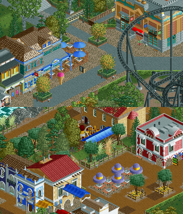
Hey, this is pretty good stuff. Loving the mexican area.
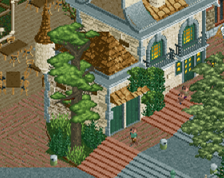
mmm that cafe is scrumptious
The building (the restaurant/cafe) on the left in the top screen looks great.
Glad to hear people like it!
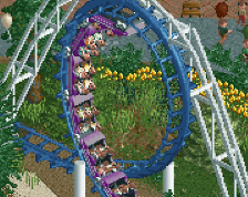
@G Force, I'll take a look at another support, but I'm keeping the flanges grey. It adds a bit of contrast to an otherwise very dark coaster.
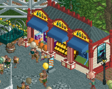
the all black coaster is a bit hit or miss, cant decide if i like it yet everything else is awesome
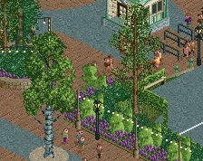
I like this actually, it seems like a slightly more detailed classic dutch/european style. It's still a bit messy but definitely getting there
the mexican area is really great!
It is a bit hard to focus on each screen separately. Would be nice if you would upload two screens instead of one. In contrast to what it seems most of the comments above, I don't really care a lot about the lower screen. Not entirely sure why. Maybe because of the blue building and the purple building on the left looking pretty simple and meaningless. The upper screen is really nice, though. The restaurant is very good. The planters could use some work. They seems a bit unrefined.
Great stuff, Jappy. Love the Mexican area. The top screen looks nice too. I would probably have the giant ice cream on the wall instead of the path. Anyhow, good job.
There's something I really like about the red 2x2 building in the Mexican area. Might be the arches on top... dunno. But either way, I think it works really well. I think everything here looks great actually. Lovely warmth to the Mexican screen, and the top screen is clean but with plenty of content.
Omg those umbrella parasols, great detail!
That top screen is quite nice, looking forward to this.
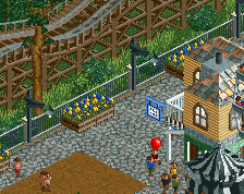
the paths are too messy, if you clean them up a bit, screen can go from good to phenomenal.