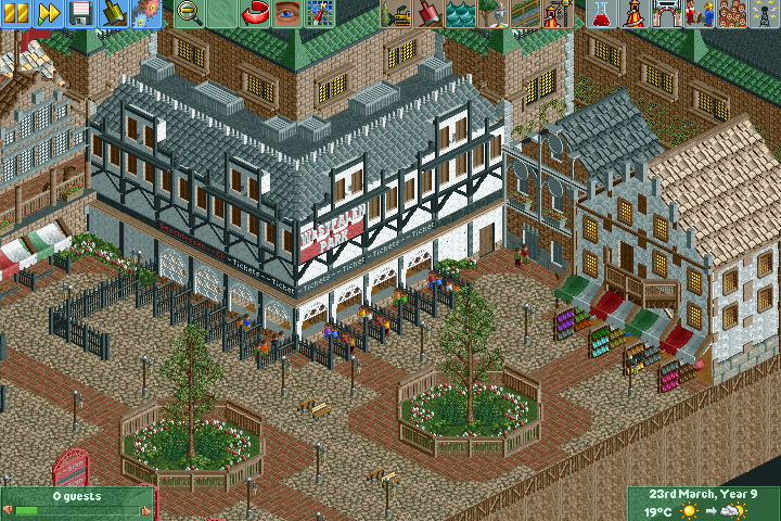
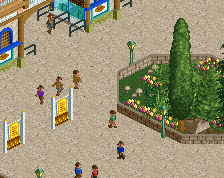
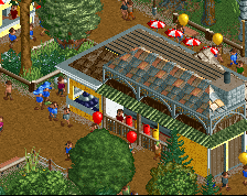
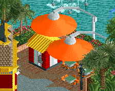
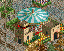
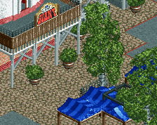
Screenshot / Westfalenpark - Entrance
-
 05-April 16
- Views 1,933
- Fans 0
- Comments 9
-
 Description
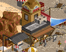
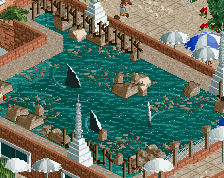
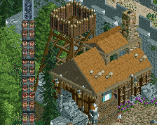
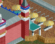
At the moment im trying to getting better by getting heavely inspired by famous awesome parks. I think its pretty clear where i get the inspiration for this entrance area from. :)
usually i wouldnt show stuff from this inspiration process im doing at the moment, but i really like the result of this try of making an nice-looking entrance area by taking the idea of an entrance from a famous park and build your on stuff with this, so i decided to show it to you. ;) -
 Full-Size
-
 No fans of this screenshot
-
 Tags
Tags
^But the question is: Does it look german enough for you?
Jokes aside, I´m not quite fond of the facades.
I like your pathwork, the q lines and shit, but the facades themselves dont look good imo :/
This looks so promising. If you made an entire park like this, I'd be your biggest fan.
Make the trees larger, they dont seem right for those planters. Also, those lamps are a little oddly placed, same for the benches in the middle of the path.
very nice
danke
feels very legacies
but lovely all the same
A lot of this feels a bit too boxy for me, with the faces of the buildings being rather flat. Nice pathwork though, and the red scrolling sign is very tidily done.
I feel that, actually, you got very few of the intricacies that were right with legacies and its entrance and actually showed some of the worst aspects of liam's (older) building style. The way you are using multiple path types makes everything feel far less open than it actually is, and the fact that the edges are square makes this even worse. A lot of your design choices with the architecture aren't working either. the way you used the curved arch deco on the brown brick building looks distasteful, and i think you could go a long way with cleaning up some of the unnecessary textures and making a more tight color palate.