Screenshot / more curvy pathways
-
 31-March 16
- Views 1,481
- Fans 0
- Comments 8
-
 Description
Another example of my attempts to create a natural curved pathway.
Currently I'm stuck having to use a particular type of path like the one seen here, I've been looking for a tutorial for the object creation program so I can make the pieces in different path types.
If anyone konows of one and could point it out to me it would be much appreciated. -
 Full-Size
-
 No fans of this screenshot
-
 Tags
Tags
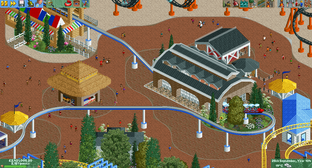
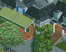
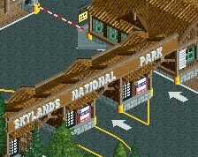
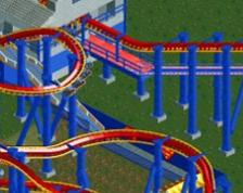
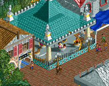
The issue with using curves is that they actually require more planning to use right and also they generally create bottlenecks between path types (e.g.: look in the thumbnail.)
It looks forced right now. I do appreciate the new objects though!
Didn't Xtreme make some curved path objects? Or are these it?
Shogo's right, it does look forced. Also, why does the monorail go through that brown building instead of staying at the same elevated height?
You're right, the pieces I made correspond to the the shape of the roadway pieces xtreme97 made (small and large curve). I haven't been able to find any path tile pieces to go with them, Maybe there are some?, i don't know.
and shotguns?, bottlenecks are a constant problem aswell as peeps getting confused and lost. The only solution I've found is to make much wider paths but it doesn't look quite right when you do that.
i'm not talking about actual peep bottlenecks, im talking about bottlenecks in the path flow
Other things I suggest you change: don't make the monorail dip into a lowered station, make the peeps climb some stairs to reach an elevated station. Looks better, and is more realistic (which I think is what you're going for). The paths are really open right now, I'd add some small planters or other features to break it up. Lastly, that thatch roof building actually goes alright with the curves, but its roof seems too high. Lower it about three units and give it pole supports!
Not bad work though, and I like that you're experimenting. I hope we see more of you!
Elevate that monorail. You could even use Map object manipulation and just add a different texture to the bottom but it would look so much better.
I like the monorail building, although I agree it would probably be better if the monorail stayed elevated. Foliage looks pretty good also imo. About the curved paths, I can definitely see how some people find it messy. However I just really like the atmosphere and feel of this screen, so I don't really mind it that much. That being said I do think there is a bit too much path, and I think the area would benefit from a bit more foliage (especially in the left and upper part of the screen). I'm also curious to see the layout of the yellow coaster.
Cheers for your feedback guys. much appreciated.
Do you know the idea of elevating the monorail station never occured to me, yet now it seems so obvious. I doubt i'll change it here though as this park has pretty much reached a dead end but i'll definitely implement this idea into future builds.