Screenshot / curvy path
-
 31-March 16
- Views 1,371
- Fans 0
- Comments 5
-
 Description
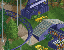
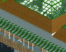
This is a screen from a project I've been working on for a while I've been trying to create the impression of natural looking curved pathways.
This has led me into my first attempt at object creation in order to get the correct shape path tiles that fit into the tight curved areas. -
 Full-Size
-
 No fans of this screenshot
-
 Tags
Tags
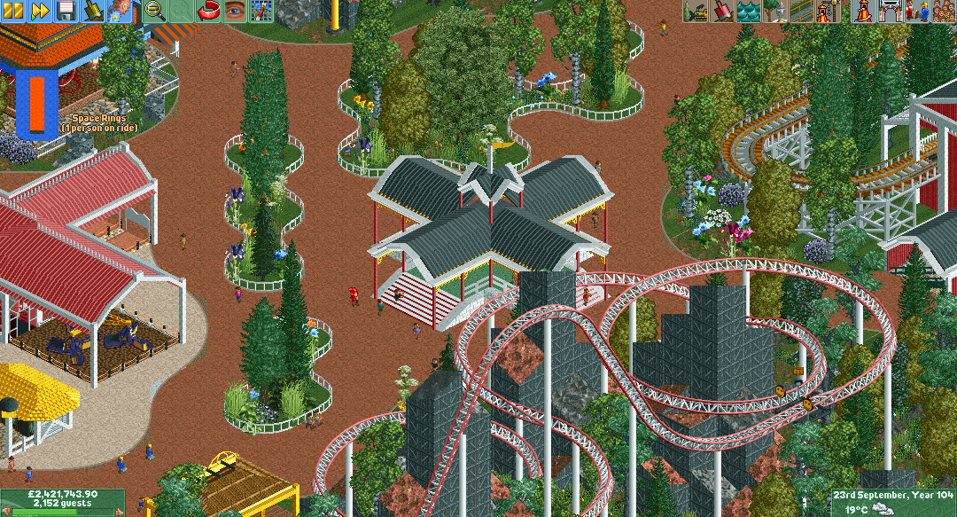
I like this screen better than the other one you posted. The curved pathways are showing some serious potential here! Keep playing with it, it may be a new trend for NE.
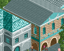
I kinda like the curves here, and that pavilion in the center is really nice I think, just maybe lacks a little bit of detail. I agree with Liampie about the giga coaster, though.
I actually liked your other screen more (contrary to what all the other people are saying ), I think the Architecture an foliage was better in the other screen. I'm also not a big fan of the Giga, it's just a really weird layout (and I love weird layouts) but not in a good way in this case. The landscape also makes it look less realistic. What I do like is the middle building, looks pretty nice. The toilet building on the left is also great imo.