Screenshot / Thunderstrike revamped
-
 30-March 16
- Views 1,821
- Fans 0
- Comments 11
-
 Description
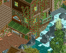
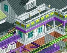
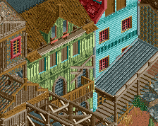
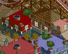
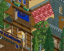
So after I finished skylands I had just enough motivation to go back to this area and redo it since I didn't like how dense the buildings were before. I am not sure what I am going to do with this park yet, but I have two wooden coaster designs I am really proud of so the plan is to make a small wooded/hilly park to showcase them.
I feel like my peepable buildings are a big step back from skylands but I am enjoying working with things other than trees and rocks for a change. -
 Full-Size
-
 No fans of this screenshot
-
 Tags
Tags
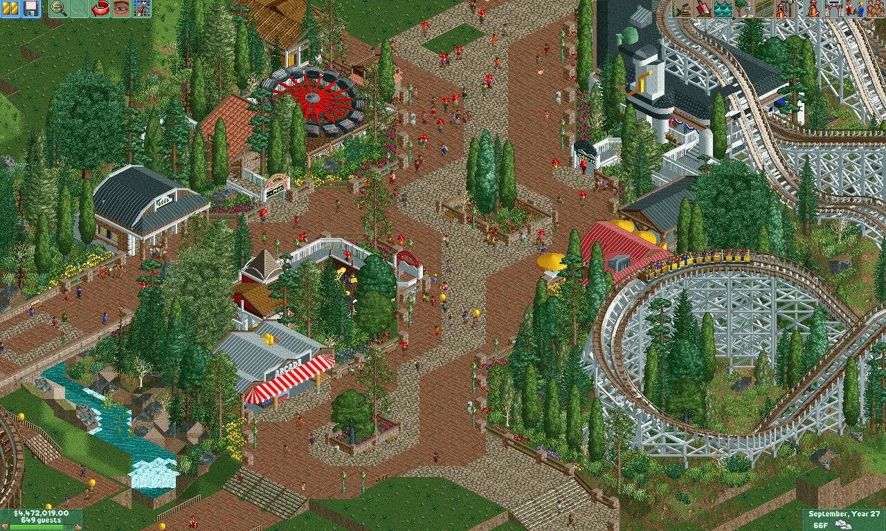
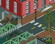
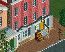
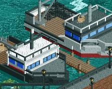


Path is super distracting, I'd try to use a completely different texture completely and utilize road lines to define the transitions from path type to path type, it helps clean up the work a lot. The rest is quite good, you do have a nack for foliage and little things. The architecture is a bit bland though, to many steel roofs creating somewhat boring buildings.
The station still looks great though, as does the coaster.
I really like it
Not a fan of the trim + brick post fences that you're using. Also, the brick + crazy paving is a bit distracting like G Force said, especially in a relatively large area.
Think about symmetry and path width when you are mixing paths like these. Otherwise I love this. I actually do like the fencing you are using and I'd say only find a cleaner way to execute it. This reminds me of a really old design I was making where Liam did some foliage work like this.
What G Force said. That path needs to change.
Good. Very nicely flowing paths, 360 guest perspective. Perhaps aesthetically a bit bland. Too many spiky trees that make this look stiff and uneasy. Maybe try darker colour for the central crazy-paving path veign.
Very nice!
really nice! very organic
Really great foliage and spacing. Though, you have imo too many roof types going on.
I think the path textures work fine together (and are fine without road lines). The pattern shapes are awkward however - I think I'd just stick with simple rings around planters and other features like the ride entrances rather than that long central stripe.
Also I think you should add a flat piece of track after the swooping turn on the woodie before it hits the hill. It'll look more flowing.
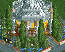
Lovely work on the custom brick planter in the centre. The domed roof effect you've created looks good too. I think you certainly have an eye for small/medium sized buildings.