Screenshot / Testing Waters (Unfinished Work)
-
 20-March 16
- Views 1,630
- Fans 0
- Comments 8
-
 Description
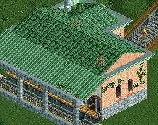
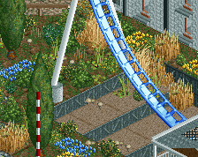
Sammys Fish Box and Enterprise, I need some feedback on making it look more realistic (Enterprise), and is this too compacted? Should I make more space for people to walk? I would appreciate all the help I can get, I'm really trying to improve my building but I feel like im missing something.
-
 Full-Size
-
 No fans of this screenshot
-
 Tags
Tags
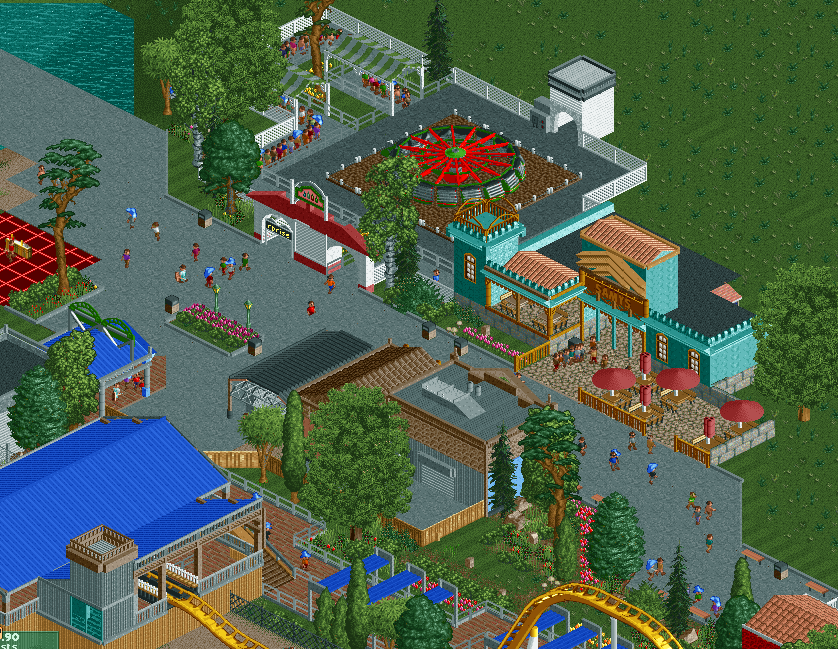
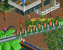
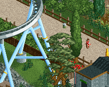
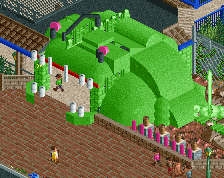
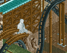
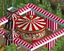
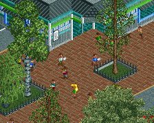
What you could try (although this might glitch), is to lower the enterprise 1 level (so actually like a quarter of the height needed to get a path under something). And then use the path scenery pieces to make it look like the enterprise is on concrete. Would make it a bit more realistic. However this might glitch. I'm also not a big fan of the ride building near the enterprise. To answer your question: I don't think it is to compact, I think the path is wide enough and it looks nice. I also like the blue building. Overall I think it's pretty nice.
^Path scenery won't work, it'd have to be an actual path object. Still a little glitchy but less so than using scenery.
I don't like how squared-off the enterprise is. Sink as mentioned above and cut the corners into diagonals. It'll make everything look less grid-like.
Okay thank you guys! I'm going to get on that right now! I'm trying to stop building so much square stuff, Its a habit because I'm used to old school style building.
Sammy's looks great (though I think you're missing an 'm' on the sign). Nice amount of deco without making the building too grand. And nope, I don't think it's too compact. I think the areas of greenery - both natural and planted - help to give this area some space, so I'd stick with that approach
You definitely have the basics of realism down: backstage areas, roof + mechanical parts, the overall look and feel.
Some tips moving forward, maybe try looking at real-life architecture and practice recreating little bits and pieces of them together. Try to collage together cool parts and ideas you find online / in photos and see if you can create your own version of them. Get inspiration photos, imagine how you can use them whole or as parts, and recombine them into your own creation.
Sketching your ideas beforehand could help you better visualize what to build as well. Keep it up.
Thank you all for the tips and encouragement! And Scoop also talked to me about looking at other people work and taking bits and pieces into my own work. So far its been working, I got some more stuff to show but this time I'm going to finish a park. I've dumped so many parks in the past few months due to lack of vision and layouts.
<3 Chemist
It's very clean and I like all the nooks and crannies. It gets a little cramped in parts, if you go the backstage/realistic shop rears route try to give it space to breathe.