Screenshot / Screenshot / Survivor Round 4 MA Tribe Dracula
-
 20-March 16
- Views 2,349
- Fans 1
- Comments 12
-
 Description
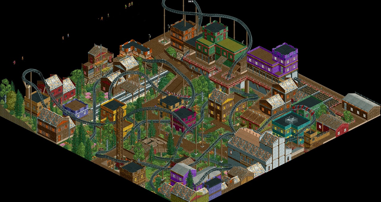
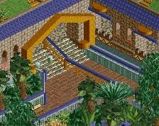
So here is my entry for the Survivor Contest, rightfully voted out in round 4.
I think I shot myself in the knee with the name though. I had a clear idea on what I wanted to build and tried to find a name during the process. I took some shortcuts durig building to cut time, wich in the end resulted in a very "samey" feel thoughout the area. Given more time I´m sure I could have gotten the area up on to a much higher level of quality, but since the whole point of the contest is the time limit... I´m fine with what I´ve got.
If you can make up a better name though, your welcome to tell me one :D -
 Full-Size
-
1 fan
 Fans of this screenshot
-
 Tags
Tags
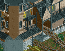
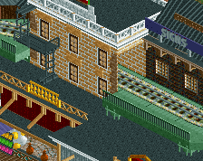
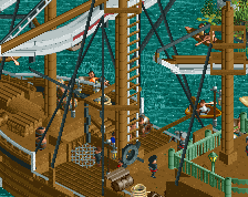
^basically this. Name was fine, but the colour and style of the architecture didn't really reflect what the name implied.
That´s what I meant. I built it and after I finished it I rushed to find a name somehow fitting to what I´ve built. And Dracula doesn´t fit the coloursheme/architecture at all in my opinion.
then why did you name it that
You should have named it Desperado obviously
Eh, I've picked worse names for projects. Almost everything I make is named only once I'm done with it.
Nah shoulda named it The amazing awesome black coaster of DEATH.
Would have fit better than Dracula...
or "The great European Scream Machine"
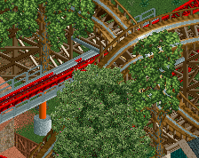
The coaster itself is pretty cool.
The architecture is all so purposeless and samey to me, like you just copied a building twenty times and gave it a different colour.
That was also a bit of a problem for me in your recent park, work on that and your projects will become a lot cooler!
I agree about the architecture. The composition, density and the way you used overhangs/levels was really good however.
nice interaction