Screenshot / T.A.R.D.I.S
-
 06-March 16
-
 Easkerton Towers
-

 3 of 12
- Views 2,499
- Fans 0
- Comments 7
-
 Description
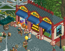
The Doctor Who-zone is finished... The doctor invites you to travel aboard the TARDIS, but beware! It's a bumpy ride through all of time and space! Afterwards, go and take a look inside our gift shop where you'll find many wibbly wobbly timey wimey souvenirs.
-
 Full-Size
-
 No fans of this screenshot
-
 Tags
Tags
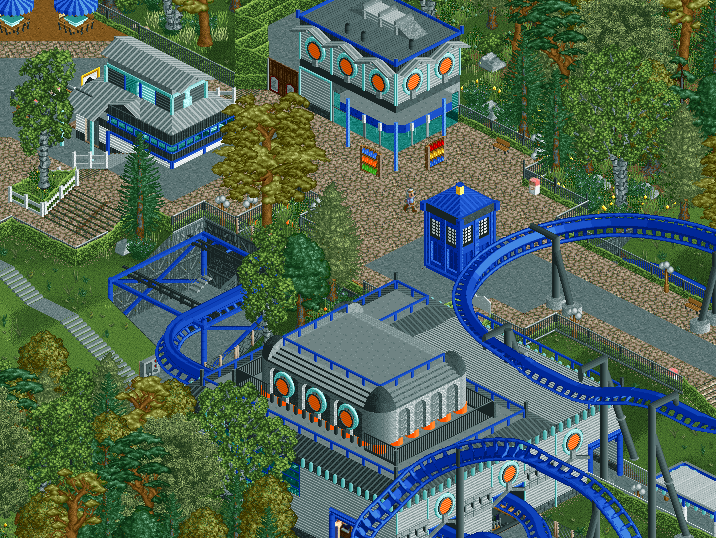
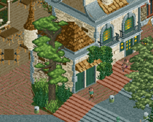
I like the phone booth, the 2 buildings in the top are also great.
I really like this! Im looking forward for this park!
I like this too. The transfer section is interesting. Your buildings are nice. I like the top building, but it looks little bit empty inside. Maybe you could add some map racks inside as well. The backstage area looks a little bit empty too. Maybe some containers could do the trick.
Overall a very nice screen! Like this a lot. I'm looking forward to see more.
its alright i suppose. i'd like to see this theme not anchored down by the "conventions" of realism, but i can't blame you for that because that's stylistic.
you have some cool aesthetics going on, but i feel you could have done so much more if you lost the dutch all together and well balls deep in the atmosphere. feels safe right now.
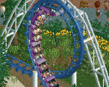
Maybe add a support where the wide turn hits the diagonal. Seems a bit unsupported to me. Looks great otherwise, maybe a little heavy on the steel roofs though.
EDIT: There is a lot of grey as well, maybe swap out the gray path for some brick type. Maybe implement some diagonal path transitions as well.
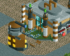
I think the TARDIS needs some more emphasis. From what I know, it's a huge part of Doctor Who, so perhaps try making it bigger or elevating it or putting a garden around it or putting it at a bigger path intersection. Something to make it stand out more.
Listen to csw. This is the iconic structure of the area and it's partly covered by track from this angle. I'd move the thing over by a tile to be in the center of that path and away from obstructions.