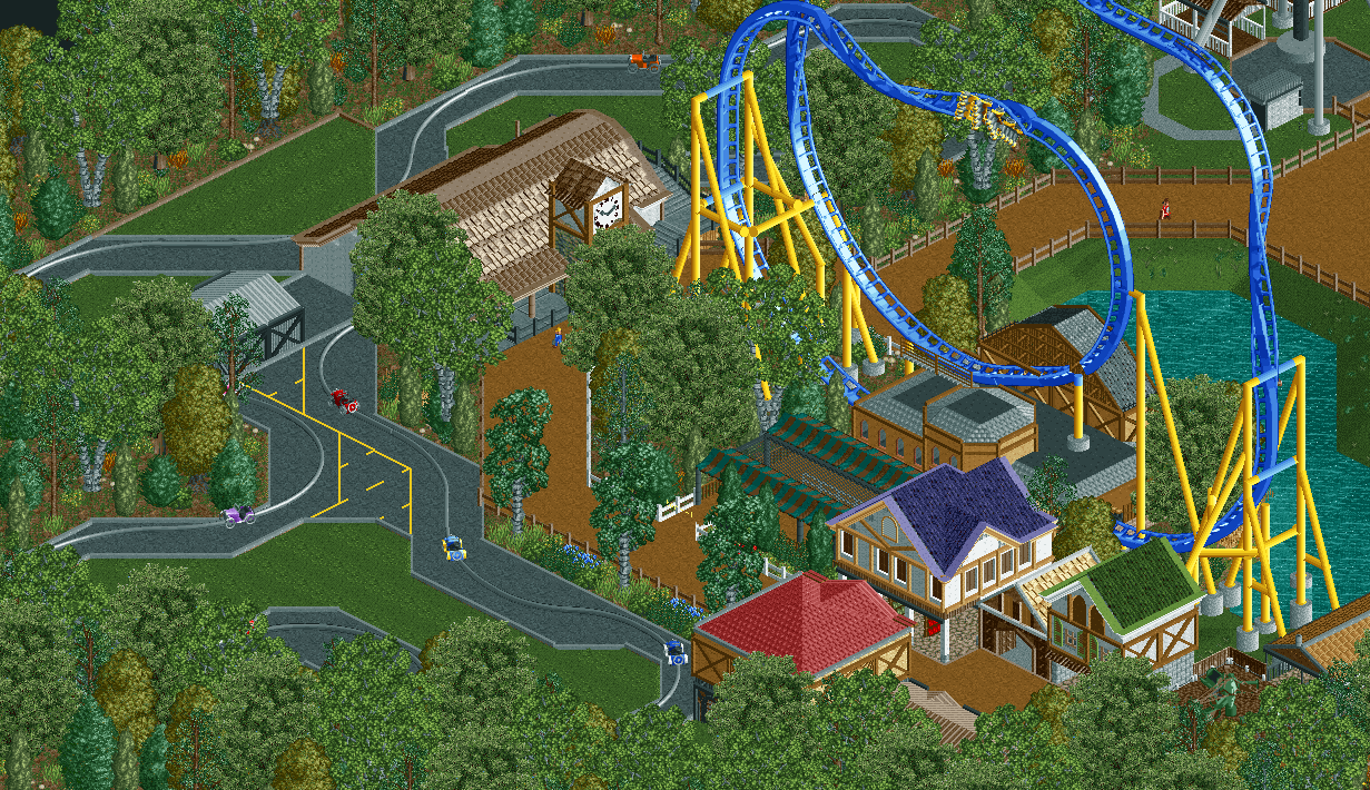
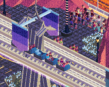
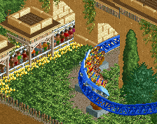
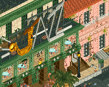
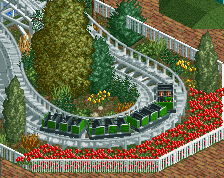
Screenshot / Aviator

11 Comments

  • Comment System%s's Photo
    comment below
  • chemist%s's Photo

    Hell yes Scoop! Thats what im talking about bro!

  • MCI%s's Photo

    Looking good! :)

  • Faas%s's Photo

    Looking good indeed. Maybe try to make the purpose of the buildings you have a bit more clear and don't forget benches and lamps and bins on the path! 

  • Scoop%s's Photo


    Looking good indeed. Maybe try to make the purpose of the buildings you have a bit more clear and don't forget benches and lamps and bins on the path! 

    lol. I know the path scenery is the last thing I will do in the park. I keep telling everyone this. but don't worry it will get done. 
  • robbie92%s's Photo

    Looks awesome! Buildings could use a little more texture variation though.

  • Deenreka%s's Photo
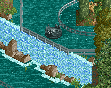
    You might want to make the 'road' on the car ride a bit wider at some spots, it looks like the cars are going off it right now.
  • Lagom%s's Photo

    This gets better for each screen, Scoop.
    I like the buildings and the coaster looks nice.
    Maybe you could add some content to the car ride. Maybe a couple of miniature buildings or a small waterfall.
    I look forward to see what you do next.

  • Scoop%s's Photo

    I actually had some buildings planned out for the car ride didn't want the area to be to crammed with buildings though. I think I might try and incorporate some sort of bridge or something.

  • Otsdarva%s's Photo

    Looks great. You're improving with each new screen. Don't place footer pieces on top of roofs. I think you should use the Giovanola hyper train instead of the floorless one.

  • Liampie%s's Photo
    Someone is a fan of Worlds of Fun :p But it looks pretty good, Scoop! Try to obscure the path less with buildings and trees, it looks really fragmentated now. I'd also avoid using a single fence type in different colours. Use one consistently in a single colour, or if you need another colour, pick another fence type. Preferably not too many of the latter either, but that doesn't seem to be a problem here.
  • Scoop%s's Photo


    Looks great. You're improving with each new screen. Don't place footer pieces on top of roofs. I think you should use the Giovanola hyper train instead of the floorless one.

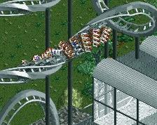
    Thanks!! I see the footer problem. I will try and use a different train type but the reason I am using the floorless trains is because they were the only trains that would simulate a skyrocket model properly. 


    Someone is a fan of Worlds of Fun :p But it looks pretty good, Scoop! Try to obscure the path less with buildings and trees, it looks really fragmentated now. I'd also avoid using a single fence type in different colours. Use one consistently in a single colour, or if you need another colour, pick another fence type. Preferably not too many of the latter either, but that doesn't seem to be a problem here.
    I do like it :p I'll experiment with other fence types.  

More By Scoop

Similar Screens

Members Reading