Congrats on your birthday!
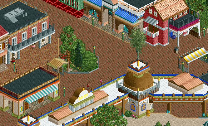
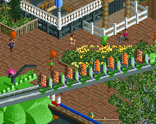
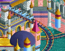
I'm not too keen on those steel roofs on the entrance(?) building. I'm also not sure if I like the squares on top of the domes. Other than that I like this. The little red building in the right corner is lovely.
Congrats on your birthday!
I'm not too keen on those steel roofs on the entrance(?) building. I'm also not sure if I like the squares on top of the domes. Other than that I like this. The little red building in the right corner is lovely.
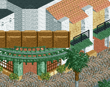
Too many textures and path types. Now it all looks so random and uncohesive.
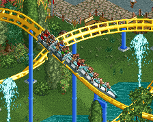
Happy Birthday! Nice screen.
Lagom - Yeah when i took the screen the squares on the top were glitchy, it usually isnt for the most part. And im still on the fence about changing the steel roofs. And thank you!
-Faas - not sure what you mean but okay, maybe i take a bigger picture to show you what everything else looks like.
-Coasterbill - thanks man! really appreciate it =)
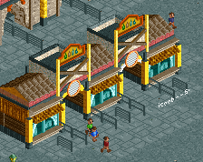
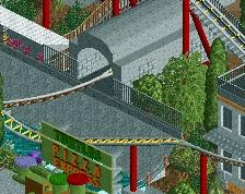
I'd be careful with not only textures but colours. On each individual building you seem to have about 5 individual textures along with 5 individual colours.
The structure forms are there, you just need to think logically about what building materials and colours to use rather than thinking 'This would look nice here'.
I'm basing the buildings off of real life buildings I took from screenshots and tried my best to make it like the screen, some of the building had different colors of materials. But I know what your saying and im being careful.
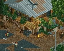
Like I said on your other screen, I don't think the buildings beyond the entrance match the entrance.
The structures match, but the colours of the entrance suggest this lush african/tropical vibe, which I thought was going to be really interesting when you first posted this, but now its standard main street style architecture, which feels odd to me.
yeah when I made the entrance I was using my imagination and when it came to the buildings after I used screens to go off . Idk how it's going to turn out but I'm going to yolo this one
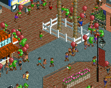
There's a lot of colour here which I think works for the most part. However, while none of it is garish enough to stand out in a bad way, I think this area would benefit from a colour scheme, perhaps focusing on the red, blue, olive mix you adopted on the entrance building.
 20-February 16
Congrats on your birthday!
I'm not too keen on those steel roofs on the entrance(?) building. I'm also not sure if I like the squares on top of the domes. Other than that I like this. The little red building in the right corner is lovely.
Lagom - Yeah when i took the screen the squares on the top were glitchy, it usually isnt for the most part. And im still on the fence about changing the steel roofs. And thank you!
-Faas - not sure what you mean but okay, maybe i take a bigger picture to show you what everything else looks like.
-Coasterbill - thanks man! really appreciate it =)
Happy birthday! Good screen but I'd consider coloring the white roof top to black.
Thank you nin! =)
I'd be careful with not only textures but colours. On each individual building you seem to have about 5 individual textures along with 5 individual colours.
The structure forms are there, you just need to think logically about what building materials and colours to use rather than thinking 'This would look nice here'.
I'm basing the buildings off of real life buildings I took from screenshots and tried my best to make it like the screen, some of the building had different colors of materials. But I know what your saying and im being careful.
Like I said on your other screen, I don't think the buildings beyond the entrance match the entrance.
The structures match, but the colours of the entrance suggest this lush african/tropical vibe, which I thought was going to be really interesting when you first posted this, but now its standard main street style architecture, which feels odd to me.
There's a lot of colour here which I think works for the most part. However, while none of it is garish enough to stand out in a bad way, I think this area would benefit from a colour scheme, perhaps focusing on the red, blue, olive mix you adopted on the entrance building.