Screenshot / Log Jammer & Frontier-Trail
-
 20-February 16
-
 G Force's Worlds of Fun
-

 5 of 13
- Views 10,255
- Fans 9
- Comments 80
-
 Description
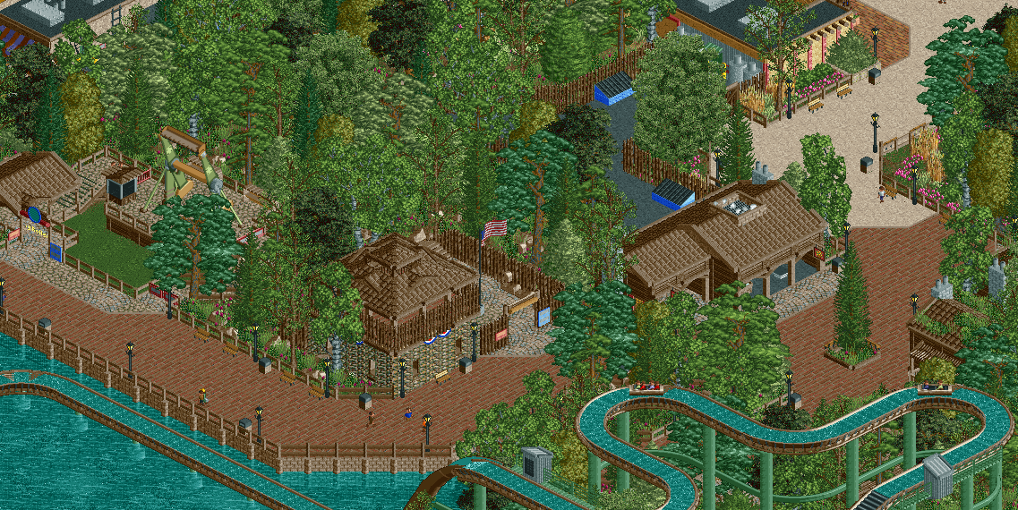
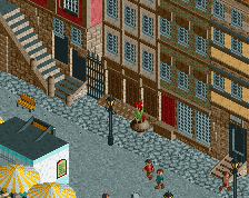
Here we have the Frontier-Trail, home of Log Jammer a Arrow Log Flume. Also in the area are Fort Madison, Log Roller (a Top Spin), and a working blacksmith shop. All providing a true frontier experience for all ages.
Also in seen is a bit of Africa, which transitions to the Frontier-Trail area. -
 Full-Size
-
9 fans
 Fans of this screenshot
-
 Tags
Tags
very very clean sir
Ohio
Do you think he has to many trees?
That's the only thing that bothered me a bit.
Is it possible to add some banners or some other form of colour to this area? I'd actually consider changing the flume layer colour to something non-brown if possible.
I'd also suggest adding some s-bends onto the log flume. It's a little too perpendicular at the moment, the turns/transitions could flow a lot more smoothly.
It's actually infuriating how fast you build, and build well
Love it, only needs another extra colour accent to make it pop
The different tree types look pretty good when you do it. The colors could improve. The whole screen is either brown and green or brown and blue. Your rides could rather easily break that trend but they're also dominatingly brown/green and brown/blue.
I love how brown it is. Like, yeah, brilliant screen
Great screen. The front building blends with the path, it almost looks as if the wall isn't there. I think you need to change the wall texture, the path texture, or add some sort of trim to define the building's extremities. Other than that A++
Swap that rock wall for the full 4-unit high one. The repeated texture ruins it.
For me, I dont really mind the abundance of trees, but the combination seems off and it doesn't blend well. Because the backstage areas are important here I would like to see them better however.
I actually think this is the best blend of trees I've seen from this project so far. Definitely feeling some Cedar Point vibes from this which is good. I don't really think it's too brown, and I like the brick path. My only recommendation would be to change the flume to be green matching the supports, I feel like that would be much better
I agree with nin. Also, you could easily remove 2 or 3 trees in this screen. Would save you some object slots as well. Maybe a custom ice cream stall or something and accompanying umbrellas could add some color and life. Good screen otherwise.
I'm sure everyone is sick of hearing it from me already, but as good as the screen is from a technical perspective, I find it very boring. The theme is generic, the architecture is well made but doesn't aesthetically look like something I'd want to experience in real life, nothing jumps out as special about this. To be honest, I wouldn't want to visit this park in real life.
And I feel that this is the case for many parks being released in this style - going for technical precision and realism without imagination or thought beyond what looks "real". Recreations aside, I would like to see more parks in which this type of realistic precision is paired with imaginative themes, like Robbie's latest Busch Gardens spotlight and Pac's themed works, rather than generic retreads of generic themes we've seen one too many times before already. I mean how many variations of Six Flags and Cedar Point (AKA themeless) parks can there be before it is bludgeoned to death? Just my two cents.
It's pretty good, but where's the trail?
I agree with all the above comments from basically everyone. Also, I would much rather see something more colonial America from you rather than this. Something that would be bright and colorful and fun. This is Worlds of FUN, right?
Keep it up; if anything your speed alone for building at this quality whether we like it or not is admirable.
Well thank you everyone for commenting, it certainly means a lot to get so many opinions and activity from my work.
However, I'm quite disappointed with the reception this is getting. Its probably my favorite thing I've ever built in RCT, and in my opinion some of my very best work.
Maybe its just the way it looks in the screenshots that makes it look worse than in game. But really, its not supposed to be uber colorful and bright. Not every park in real life is a bright rainbow of colors, nor does every theme harbor very liberal usage of color. I feel NE recently, or maybe always, has always valued how many colors and architecture one can shove into a small screenshot and therefor base their opinion on that. Truly, gauging a park based on a few small pictures is a pretty poor way of doing this. Which is one reason why I really dislike the screen rating system, because I feel people base their opinions on how to rate parks on the quality and ratings of the screenshots they advertise with and how the map lives up to the expectations those ratings create. Rather than separating the two and viewing them separately.
With this park I'm trying to do some different things with foliage and layout that I or a majority of people have done. Which is why it might come off as mediocre in these smaller screenshots. Another big focus on this park is spacing and density, as I always have felt that NE parks are super compact and dont accurately portray the space between rides and structures present in real parks. Again, this is probably had to see in the screenshots as much of the transition and "empty" areas aren't the focus of the screens and may come off poorly in the small amounts they have been shown in the last few screens.
This area is based heavily off the Frontier Trail at Cedar Point, which is one of my favorite areas of the park when it is running at capacity. Personally, I'm super happy with how it turned out and is exactly how I pictured it being built in RCT, which makes it all the more difficult to change it.
Anyways, sorry about the rant, but hopefully this will become more apparent when the park is released. But I will definitely look into changing a few things:
The log flume colors will be changed to match the supports all the brown will be removed, this was actually something I intended to do before posting but must have missed. I also brightened up the colors of the top spin a bit, but again I dont want to do this too much as to make it distracting from the rest of the area or look out of place.
The brick path might be switched to something a little less textured, although I want to keep the cena path as I feel any other blends to much and doesn't allow enough contrast with the wood architecture. I'm also trying to refrain from using to many path types in the area, so I want to limit to 2 or 3.
I will try and replace the stone walls if I can find a 4 clearance tall version, although skimming through them I could only find 4 clearance tall versions with windows or doorways, but perhaps I just missed them.
I think its perfect and amazing and I love that its so colourless and brown.
Don't listen to anyone else cause I'm the only person that matters at this site.
<3