Screenshot / Temple Sarnath
-
 17-February 16
-
 Reddit Contest [Expedition Everest]
-

 3 of 5
- Views 2,837
- Fans 4
- Comments 12
-
 Description
Yes, I still play this game.
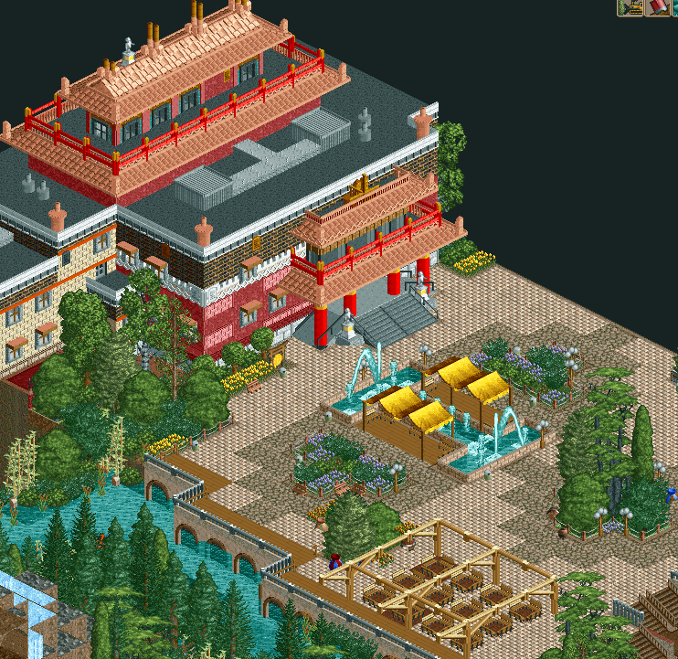
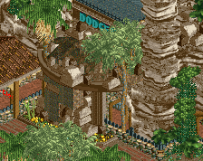
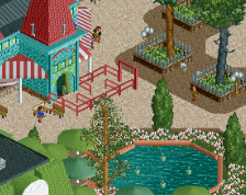
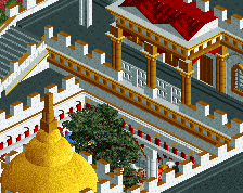
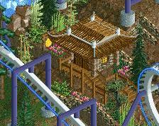
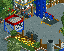
December contest bench + 1k bamboo shoots, temple in corner of the park. Sorry about all these map-edge pictures, I know it's not the best but the entire map centre is the coaster + mountain.
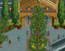
I could probably redo the fountain, I'm not sure if it's quite iconic enough for the area. I also kind of have to redo it because it's not centred with respect to the actual temple -_- -
 Full-Size
-
4 fans
 Fans of this screenshot
-
 Tags
Tags
I think it looks great. Perfect colors.
fantastic work
The building structurally is well done but I think you have a bit too many textures and comes across as messy. Try and keep things clean if you can!
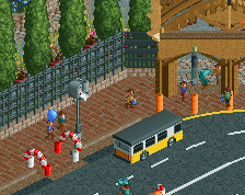
Same goes for the paths, I think you have one too many and I think sticking to one or two would be perfect. Especially once you relocate the fountain.
Fantastic, shame it is so close to the edge of the map however
The textures are brilliant. Love this!
Thanks all.
I will definitely try that Steve, the actual texture is mostly brick but needing to add the windows meant I couldn't get the red-brick texture that I wanted [needs two wall objects]. I'll probably replace the wood path, move the fountain more centrally with respect to the temple entrance, and then add another building on the left by the water.
Very nice!
PBJ Offline
missing a bit of black graveyard wall on the building... I guess...
Like the rest said to many path types... try using max 2 types.
But a great screen...
I was going to suggest placing the fountain more central to the building, but you've addressed that already. Everything else is great. I really like the foliage and the warmth given off by this. The only thing I'm not too sure on is the black railings and grey path leading into the temple. Is there not another path type more in-keeping with the tiled theme?
It's quite beautiful although that seating area isn't too aesthetically pleasing. Clean some things up more like those orange lines don't really work and that planter in the centre of the screen isn't really necessary to me.