Screenshot / Conquistador
-
 16-February 16
-
 Emerald Pointe
-

 6 of 23
- Views 3,328
- Fans 6
- Comments 22
-
 Description
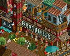
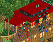
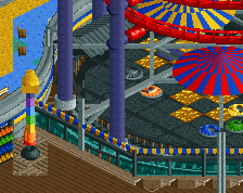
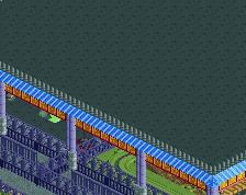
I've taken a lot of the feedback I've gotten into account and continued to develop the area around Conquistador. In honor of reaching year 200 I figured I'd share my progress. I've had a ton of time to build on this lately and feel really good about the way this new area is shaping up. The building on the left houses "El Estruendo" the park's Bumper Car attraction.
-
 Full-Size
-
6 fans
 Fans of this screenshot
-
 Tags
Tags
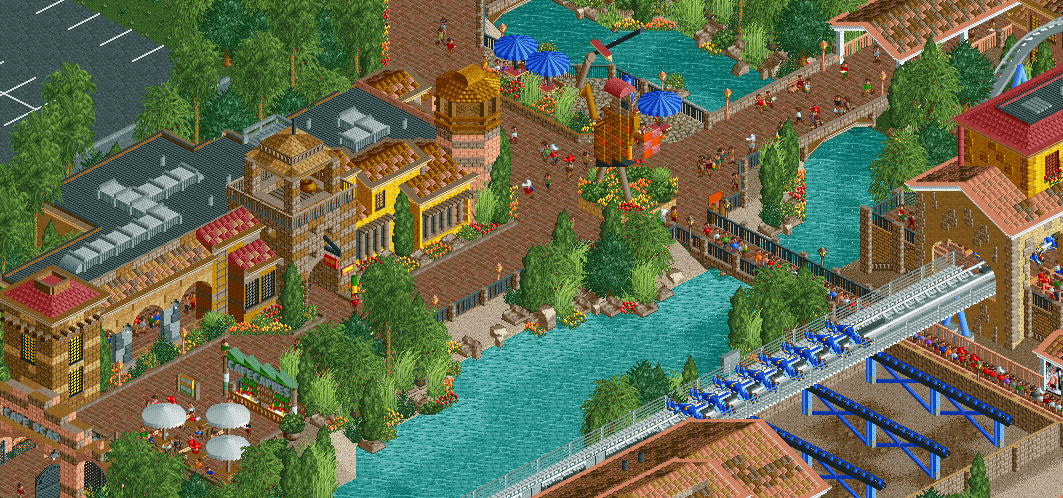
It's almost Amazing except for the 1k Ruins next to the water. I think they could be cleaned up a bit.
Wow Bill, That statue in the middle is top class. All looks awesome to me. Well done.
a little busy for me with the bright palette and bricks+tile roof, but compositionally this is excellent.
That middle area around the buildings and statue is fantastic, probably the best stuff you've ever done. The coaster could use a bit of work though, the area around it seems a bit sparse and the station looks out of place in comparison to the other buildings, based on the little we can see.
This is really shaping up to be a great park, hope it wont take you to long.
This is just great. The gold/yellow on the station is a little bright and the landscaping is a little sloppy but it doesn't bother me that much. I'm really excited for this park.
Best screen so far. Statues are very tricky to do well, and I'm not sure that you've accomplished that here, possibly a combination of the stone textures and how thin it looks.
Agree re: rockwork and the yellow on the station. Maybe some underwater foliage/rockwork by the edges could help(?)
The row of shops is glorious, arguably your best stuff yet
This is awesome !! I like the colors
Hey Bill, who'd you get to build this park for you???? Yeah, you're breaking new ground, and the ground is quite lovely I might add. A fresh style for you, and I think fresh for NE too. It's clean, it has atmosphere, it has character, it has variety, it has nice colors! Great work!
Oh fantastic. Messy in places.
Looks awesome! Perhaps a bit brown in places but it's balanced out well enough with other colours.
PBJ Offline
GReat screen!
Underwater it's to clean\empty to me...
Add some underwater bushes\rocks.
I completely agree with the points Stoksy mentioned. Otherwise, this is your best screen ever. Great work!
perfection
This is awesome!
Damn dude - this is looking so organic. It looks adventurous and harmonious at the same time. Two suggestions are to add underwater rocks, and to throw some single-colored Spanish roofs in with the multi-colored ones.