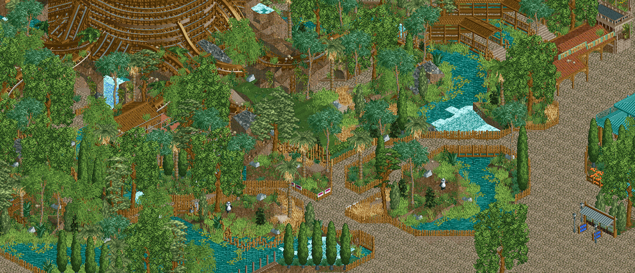
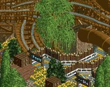
Screenshot / Discovery Island Trails
-
 14-February 16
- Views 3,260
- Fans 4
- Comments 24
-
 Description
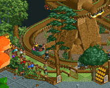
Adventure and wildlife awaits at Disney's Animal Kingdom. Explore the trails and encounter river otters, American porcupines, and red macaws. Or, join Flik from Pixar's A Bug's Life in the Tree of Life for the 4D experience, It's Tough to be a Bug!
-
 Full-Size
-
4 fans
 Fans of this screenshot
-
 Tags
Tags
Otherwise I think this is phenomenal work. Very adventurous and smooth.
Hopefully we can see more from this soon.
This is fantastic Steve! I'm really glad to see you working on this again.
Seems Kyle has some competition...
Fantastic to have you building again Steve
I'm not sure what I think about the trunk of the giant tree. Maybe it's just because you don't see all of it.
Everything else looks so good. Very pleasant to look at.
I'm jealous of your foliage skills.
Wow that looks beautiful. Love the unusual palms you have mixed in. I'm also not feeling the giant tree made of track.
Those custom palm trees really add a lot to the overall look and feel of this screen. Great work!
Yeah this sucks because now I have to go and make mine better.
Fuck Steve.
foliage and atmosphere is so on point
Side note: watch your sight lines. What is the "front" of the tree/exhibits doesn't offer good photo spots for guests. It's no clearer than standing anywhere else (which isn't a good thing).
8's are thinner than B's but look very similar on signs. Could try using those instead, if you want to avoid the textspeak.
Who made that custom trees? that looks phenomenal.
Yeah, where do these palms come from? Liampie? They look great.
Great screen. Not sure about the giant tree either. Seems to stick out badly, but I'm not sure how to improve it. The pandas definitely need a shelter. And I think brown will look better for the 1k ruins, but grey is fine as well. It's good to see you continuing this park.
PBJ Offline
Just pure love from my side of the table!
Love the chaotic feeling.... just missing lamps, benches and bins on the side of the paths
Thanks everyone for the kind words.
Liam indeed made those new custom trees. The man is the master of custom foliage and a huge help. Thanks again, dude!
I didn't even notice the sign -- will make the proper changes, of course. Thanks.
As for the large trackitecture tree, I am open to suggestions. For getting a large rounded structure with flowing roots and branches this seems like the best way. I could do some testing with objects but I can only see that coming out as blocky or sterile. We'll see.
I'll take the sight lines into consideration. I thought they were fine being that the trees that ARE in front of the tree are pretty narrow. The paths will get warmer once I add the appropriate details too, I think.
Thanks again, everyone!
PBJ Offline
for every one that want some little bit other trees....
I place a tree and place a other tree in ZC but a bit higher throu the already placed tree... it can give the trees a little bit other shape or color... simple trick i use
Just want to tell you, me and you have the same real life name. Second your a big inspiration to me. And third this shit is dope