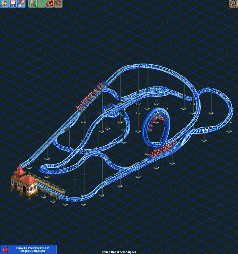
Screenshot / Mack train testing
-
 07-February 16
- Views 2,712
- Fans 5
- Comments 8
-
 Description
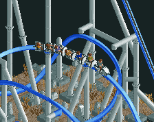
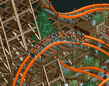
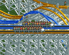
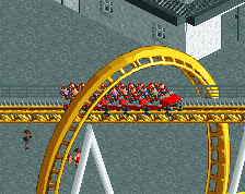
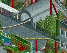
This is my first test of my Mack mega coaster train. It's still missing restraints because those are proving a bit tricky, but the rest of it is pretty much finalized.
I might change the color scheme - the choice of grey as the base color instead of black is closer to the real thing but it doesn't seem to go well with many other colors - it always looks oversaturated. It seems to me that RCT2 trains have to have a sufficient amount of black to increase contrast between the different colored areas. My Intamin wing coaster suffers from this problem as well; the color scheme was chosen to match the real thing, and it looks awful in game.
I'm also slightly concerned that they look too big, but I think that's just in comparison to the RMC I did which was a total failure really. The wheelbases do match the track in game and the diagrams I had did have dimensions, so if they're too big then something is wrong with my renderer, and I think I would have noticed that by now. I will see how they look with peeps and restraints. -
 Full-Size
-
5 fans
 Fans of this screenshot
-
 Tags
Tags
Holy sh...
I need those trains badly. They look so good!
I'm really impressed by your work. Wow!
I don't think they look too big. And the grey is totally fine!
When do you expect to release them?
Are they "quiet" like real Mack trains? That would be great. I mean like the same sound as, for example the floorless coaster trains(?)
I hope to release them soon but I still need to model the restraints, and I don't have much time at the moment because I have a lot of other stuff to do. The restraints are the only real work left to do on this, after that it's just minor stuff like taking the preview image and choosing a friction value.
I probably will change the grey though. It looks decent with the blue and red but when I try lighter colors for the train there's not enough contrast. If not black, I might just make it a darker grey.
The sound is set to the floorless coaster sound. There are only two steel coaster sounds in game - the other one is used on the corkscrew coaster. I can select which one to use but I can't add new sounds.
I don't think they are too big, they just looked it when compared against the RMC I did (which did look quite small). Compared against the game's Intamin trains I think they're fine.
Thanks for your response.
A darker grey would probably work too.
Good to know about the sound.
Once again. Your work is so impressive. I appreciate what you do for the RCT2 community. Let us know when the train is released!
They look pretty good, but I agree with you on the grey parts. It looks too saturated and the shading seems to be lacking. If you can get some shading on the grey parts this would look much better I think. But still, pretty sweet man .
.
It's very difficult to acheive better contrast using just the lighting because you only have 12 shades of each color to work with, and if you reduce the ambient term too much the shaded side looks too dark. I already experimented extensively with the lighting when I first implemented it and though it's not perfect, I'm not really sure what I can do to improve it.
I may make the base black but leave the seat backs grey, so there is some contrast between them. I can make more areas recolorable but I only have three remappable colors to work with.The hard part is making it look good across a range of color schemes.
this will chance something. Blue Fire recreation incoming
thanks man!