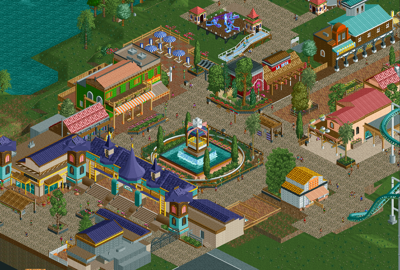
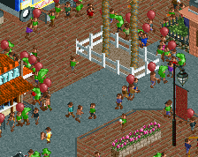
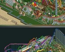
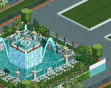
Screenshot / Mystical Kingdom Front View
-
 03-February 16
-
Mystical Kingdom Fun Park
-
3 of 6
- Views 1,621
- Fans 0
- Comments 7
Community Forum Software by IP.Board
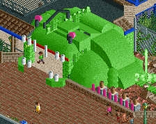
You seem to have a very good eye for colour.
Thank you =)
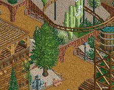
despite the unfinishedness of the screen this has a lot going for it. The color pops in vibrant ways that actually work, there is decent architecture, and there is an all around great flow to the layout of the screen. I think that there is a bit too much purple but that could be again the "unfinishedness" speaking.
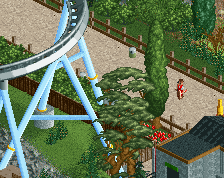
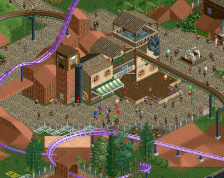
This is looking really nice, some refining and finishing will do wonders here. A few tweaks I'd recommend: the roofs on the entrance towers still looks weird so try to simplify them, and the closed umbrellas should have one more unit higher to match the height of the open umbrellas.
Love it
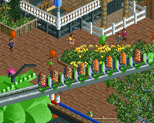
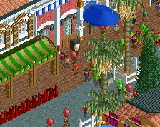
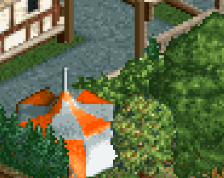
I really like your foliage and planter work. That tiny flower box against the building on the right is so small and simple, but works so well.