Screenshot / TBA Jungle Area - Jim City Amusement Park
-
 12-January 16
- Views 1,861
- Fans 2
- Comments 12
-
 Description
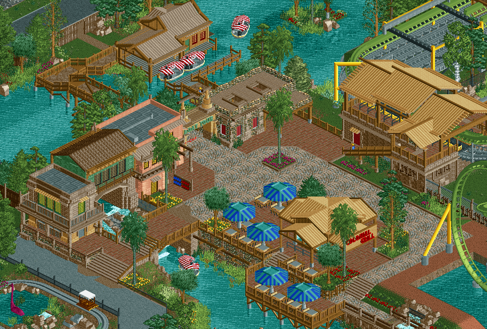
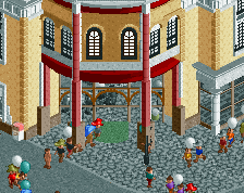
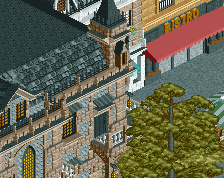
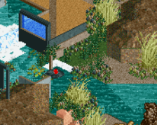
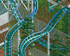
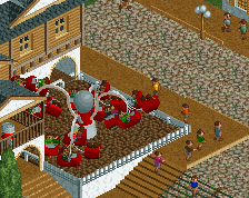
Tired of walking around and standing your foot into your stomach... Enjoy a relaxing ride on 'Steamboat Jimmys Swamp Tours'. Explore the wonders of the of the hot and exotic continent, witness the thrilling ride of 'Praying Mantis' from an exicitng new perspective, all with a cool breeze of air flowing through your hair... Or simply enjoy a freshly prepared burger at the 'Colonial Grill' restaurant.
-
 Full-Size
-
2 fans
 Fans of this screenshot
-
 Tags
Tags
WOOOW!! Nothing but love and praise!
So good!
Great work.
Oh and try and give your raft and coaster stations a bit more character. They're technically good and very clean but I feel like they're missing something.
Reminds me a bit of a combination of Disney Earth and Extinction. Looks very good!
Good screen.
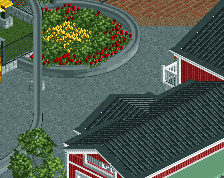
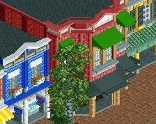
The station building is great, i really like it a lot. I'd think the grill building could use a bit of work though, it seems to match the station too much, and I think it's missing a chimney.
thanks for all your input guys! A chimney would probably solve most of the smoke issues in the restaurant.. no wonder no one is dining there....
I'm at least gonna revisit the roof.. I already changed the path textures to a more dirty look, added some more foliage, etc
I would simply be repeating what others have already said, they've given you some great ideas to improve. It's great to see some new Jimmy work though, keep it comin'!
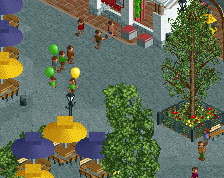
Its all well made but just doesn't feel organic in terms of layout. Might be all the right angles and such but maybe implement more diagonals or even curves into your path. You could probably clean up the bridge over the river boat ride as well, some clipping objects there. Good to see some full scale work form you, I'm definitely interested in this project thus far.
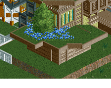
I'd echo much of the above comments. I would perhaps also suggest restricting the light-brown steel roof to just the coaster station. I think it looks good there, but is trivialised by the smaller building with exactly the same roof texture and colour. It detracts from the main building. Maybe try wooden roofs?
Excellent work overall, just the cena path doesn't fit at all with the jungle vibe that much of the architecture is portraying.