I agree, I actually think the problem is accentuated because of the roof texture though. Maybe try the black tarmac path? And try to add something to the actual facades other than the track overhang.
I rather like it but I agree with stoksy about changing the roof paths. Although I would go for dark brown .
Some glass (abstract) mini golf stations might be a good way to add interest to the facades and introduce another colour. You could also use Dodgems sunk into the middle of some of the larger areas of roof.
I think its the texture of the roof combined with the texture of the path.
I would actually replace both. Make the roof texture a bit flatter, but also make the path texture a bit less in your face too, use the red tile as highlights and extras rather than the main bulk of the path.
I really quite like it. Don't mind the rooves too much. The area would benefit from some more directly visible attractions though. Everything seems to be going on indoor.
I'll work in different colors, especially on the roofs, kind of went overboard with them a little. As for the facades, well, I'm not sure what I can do but that doesn't mean I wont try. There will be an exposed flat just to the right side of the area shown.
Thanks for the comments, I'm still new to LL I guess, so at this point there is still a lot of experimenting.
I think the roof would work if you got rid of the path edges/supports, although that maybe is against the more simple look you're going for. It was possible in pre codex LL though.
The structures aren't distinguishable from each other. I had to look for which was the House of the Future and which was the other.
I get that Tomorrowland is typically a street with two sides of futuristic facades that mirror each other, but the actual attractions have unique signage or traits that distinguish them. As awful as something like Stitch's Great Escape or Monster's Laugh Floor is, I can clearly point them out to you when walking through the land.
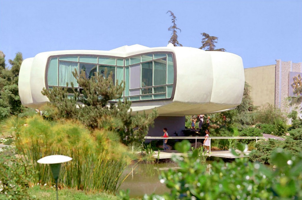
Just a suggestion, but you could make something like the original House of the Future...
it's too roof-fest.
Also, It's hard to see what's going on at first glance.
I agree, I actually think the problem is accentuated because of the roof texture though. Maybe try the black tarmac path? And try to add something to the actual facades other than the track overhang.
Jesus christ, those paths
I rather like it but I agree with stoksy about changing the roof paths. Although I would go for dark brown .
.
Some glass (abstract) mini golf stations might be a good way to add interest to the facades and introduce another colour. You could also use Dodgems sunk into the middle of some of the larger areas of roof.
edit: reminds me a bit of this - http://www.nedesigns...e-serious-note/
I think its the texture of the roof combined with the texture of the path.
I would actually replace both. Make the roof texture a bit flatter, but also make the path texture a bit less in your face too, use the red tile as highlights and extras rather than the main bulk of the path.
This is unique.
I really quite like it. Don't mind the rooves too much. The area would benefit from some more directly visible attractions though. Everything seems to be going on indoor.
Now I know why the overview you posted was all gray
It's really interesting and refreshing. I definitely agree with the guys above. I would recommend some more black to add some contrast.
I love the tile paths! I agree with posix, the main thing missing is at least one visible ride.
I love the touches of checker path.
I'll work in different colors, especially on the roofs, kind of went overboard with them a little. As for the facades, well, I'm not sure what I can do but that doesn't mean I wont try. There will be an exposed flat just to the right side of the area shown.
Thanks for the comments, I'm still new to LL I guess, so at this point there is still a lot of experimenting.
Technically not really bad, but it hurts my eyes.
yeah the only problem you're having is the fact that looking at it gives me a headache
I think the roof would work if you got rid of the path edges/supports, although that maybe is against the more simple look you're going for. It was possible in pre codex LL though.
The structures aren't distinguishable from each other. I had to look for which was the House of the Future and which was the other.

I get that Tomorrowland is typically a street with two sides of futuristic facades that mirror each other, but the actual attractions have unique signage or traits that distinguish them. As awful as something like Stitch's Great Escape or Monster's Laugh Floor is, I can clearly point them out to you when walking through the land.
Just a suggestion, but you could make something like the original House of the Future...