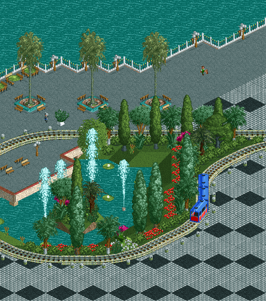
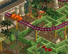
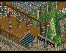
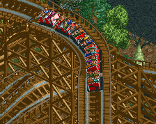
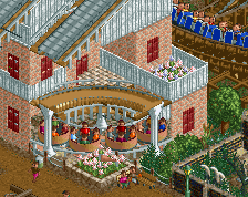
Screenshot / Kemah Boardwalk #1/5
-
 03-January 16
-
[Cenceled] Kemah Boardwalk
-
1 of 4
- Views 2,799
- Fans 3
- Comments 14
Community Forum Software by IP.Board
![screen_2482_[Cenceled] Project Undercity #1/5](https://www.nedesigns.com/uploads/screens/2482/2482_thumb.png)
![screen_3002_[Cenceled] Kemah Boardwalk #2/5](https://www.nedesigns.com/uploads/screens/3002/3002_thumb.png)
![screen_2679_[Cenceled] Kemah Boardwalk #1/5](https://www.nedesigns.com/uploads/screens/2679/2679_thumb.png)

Is it Key-Ma or Key-mah?
<3 u pierrot
Those tram poles and the planter are brilliantly found! Excited to see more.
Eh... dunno. Very sterile and just a lot of forced hacks I think.
Those trash cans are clever! I'm not sure I've seen that done before.
Please do some more RCT2 too.
I agree with posix, but it doesn't have to be a bad thing. It's just the screen I suppose. You can take a screen of almost any park and it'll come out as sterile, if you tried to include as much path as you could. Aside from the purpose of that path pattern (pathern?) at the bottom not being very clear to me, I cannot fault anything shown here. Love the use of trash bins.
very pretty
Really cool, a lot of subtle things to appreciate in there. The trashcans along the track look great.
Stick to LL, there just something magical about you're style that makes almost anything look fantastic and unique.
Sterile. Yes. Clean and beautiful. Also yes.
And people said Westwinds had a lot of trashcans.
Hahaha yeah.
The funny thing is Westwinds trashcans gave me this idea.
Thanks for kindwords, I fully appreciate the sterileness, it's my most weak point. I promise next screen will be more pleasing.
I'm not sure about the black path squares - stands out too much and rather than adding interest to the path it just exaggerates how much path there is. Crazy paving might be a more subtle option and inject a bit of warmth too.
I don't like the black path squares either tbh, also that blue border around those palm trees have to go. Like they're to distracting and just plain out ugly. I really like how you chose that tram though. I never seen it used in game before and its cute.