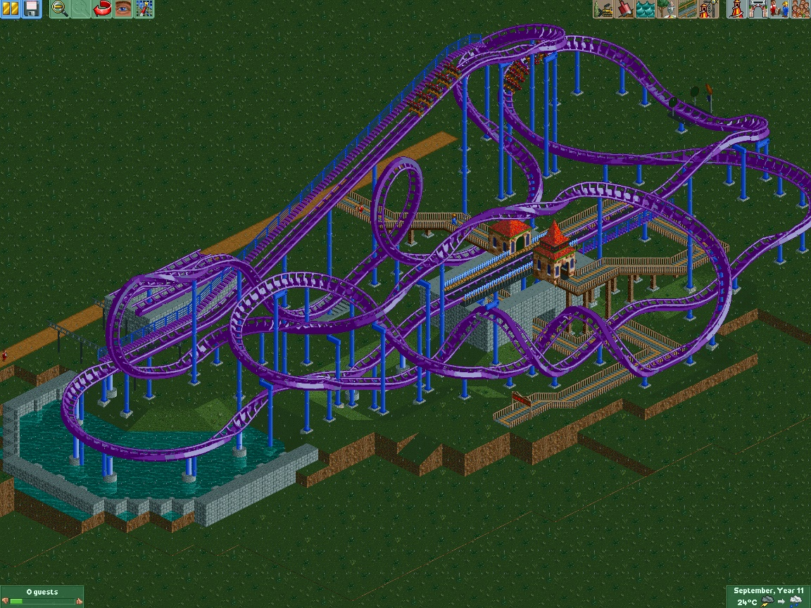
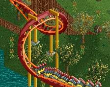
Screenshot / Daemonis

7 Comments

  • Comment System%s's Photo
    comment below
  • battle boy%s's Photo
     
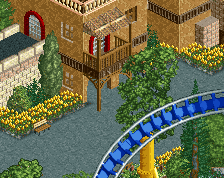
    a great start of something cool! . I would think about other, more matching colors ( although it's a matter of taste ) :)
     
     
    a high degree of difficulty set of custom brackets if anyone needs them ...
  • Bubbsy41%s's Photo
    I really like this. The layout is really cool and the station has a lot of potential with that barrel roll going through it. The colors seem to conflicting I'd go for something more cohesive maybe yellow and light blue or a dull red with black.
  • Austin55%s's Photo

    That's quite impressize and looks like it'd be loads of fun. 

  • F0ndue%s's Photo
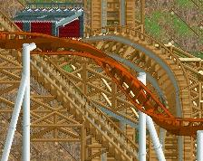
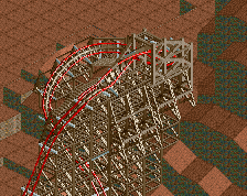
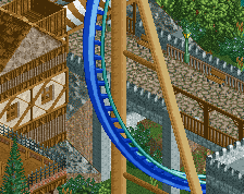
    Yeah. I sat 3 days on that layout, trying to cram in as much stuff as possible on a small footprint. The coaster is about 880 meters long, but is still below the 20 meters mark. That section around the initial heartline-roll will be a pain to support. First time I'll do custom supports on a B&M.
  • Austin55%s's Photo

    The tricky part will be building the station under the supports

  • F0ndue%s's Photo
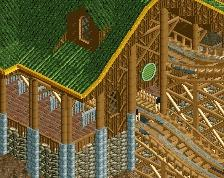
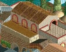
    Since I grew up in Hessia I wanted to include some architecture from there in this project. I like I said, I am not too good at architecture, but I think this is a good opportunity to try something new. So, I want to build something like this.
    Attached Image: CRW3739-Fachwerkhaus-Detail.jpg
    Shouldn't be impossible to slap the supports of the Zero-G-Roll somewhere on that roof. Also, thanks for the positive responses.
  • nin%s's Photo

    It just needs more finish is all.

  • Description

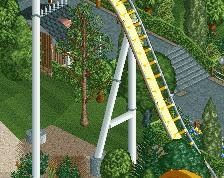
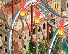
    So, I didn't get anywhere with my current park and decided to start a new project to work on my building skills. I want to create a small park somewhat similar to Tivoli Gardens and obviously the floorless coaster is supposed to be a beefed up version of Daemonen. I have a small scenic railway planned as well, but that concludes all thatt I want to put in this park coasterwise. I know, it is barely finished, but do you think the color scheme is too shrill for a park that will mainly have european architecture?

  • Full-Size
  • No fans of this screenshot
  • Tags

More By Live on earths ass

Similar Screens

Members Reading