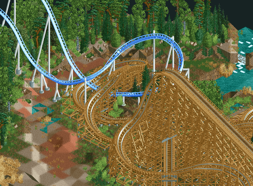
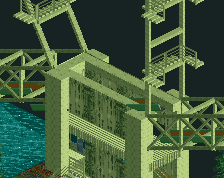
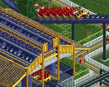
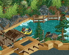
dude there's something ever so slightly off about your layouts. I think you have the radius of the turns larger at the top than at the bottom when normally it's the other way around. If you switch it up its more pleasing to the eye and more realistic. Its not so much in this screen as some others, but the woodie transition gets thrown off by it. Imo, it's what is holding your layouts back from being pretty damn good - and the screens for that matter.
@dr dirt: this screen has nothing to do with my other ones (luckely), I know what you mean but at this screen the curves at the bottom are bigger then the the ones up top. Maybe its the way RCT looks in certain angles.
 02-January 16
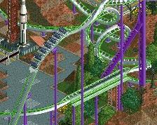


Hey, another Voyager-looking screen! Looks epic. And pretty flawless.
Wow!
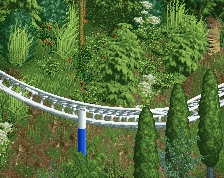
Ugh, look at those curves. Marvelous.
I knew you had potential. Just need to work on your architecture skills.
drool. I love it.
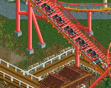
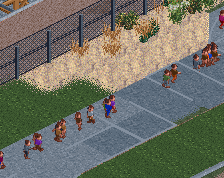
Unnecessary extra catwalk on the wooden coaster 2/10
Liampie, on 03 Jan 2016 - 12:13 AM, said:
This looks nothing like the Voyage
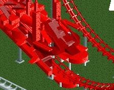
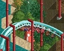
It's nice interaction, but I feel that you could do more with the hyper turnaround. Too low for me.
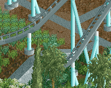
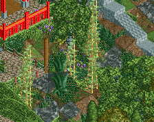
the foliage is to die for
Thanks all,
@dr dirt: this screen has nothing to do with my other ones (luckely), I know what you mean but at this screen the curves at the bottom are bigger then the the ones up top. Maybe its the way RCT looks in certain angles.
https://i.gyazo.com/...f2dca2caa2f.png
The hyper is indeed kinda low in height. I might change it, I might not; since its chopped of at the map's edge and I kinda like how it looks now.
Incredibly gorgeous stuff!!