Screenshot / Other Entrance
-
 02-January 16
-
 Urban European Adventures with Faas
-

 9 of 18
- Views 2,053
- Fans 1
- Comments 10
-
 Description
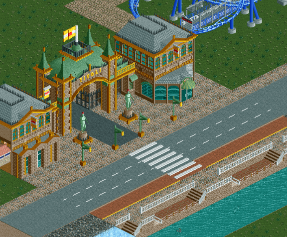
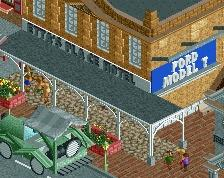
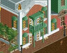
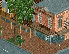
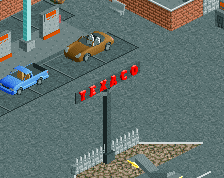
This is the entrance on the other side of the park. This area replaces the hill I have posted in another screenshot of this project, since the hill would have left me with too little space to build more cityscape and this second entrance.
This one is more obviously based on a European building. -
 Full-Size
-
1 fan
 Fans of this screenshot
-
 Tags
Tags


Oh and happy new year!
This is the least Faas-y thing you've ever shown, and I think that's good thing. Not that I don't like your usual style, I do, but it was time for something radically different. This stuff is exciting!
Love the bicycle too.
Very ncie! More finish is needed.
Dang you Faas, I wanted to do a Tivoli-style entrance in my new project
It's very recognisable, and like Liam said, very different from your usual style. It's all good!
Very nice entrance. Like it a lot.
Never really liked that object for the zebra crossing.
I would use the half quarter tile flat roof texture instead.
Anyhow can't wait to see this park finished.
literally the best thing you've ever made and its because it's not your style at all
Thanks, I guess? Haha. I'm trying to become a bit more versatile when it comes to styles I can build in. I probably have about six parks in the making now, all of which sort of tackle a different style or a different aspect of the game, pretty fun actually.
Thanks to the others for the replies as well.