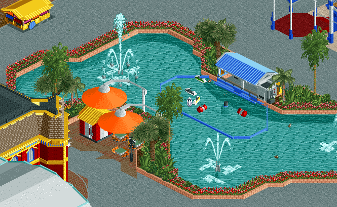
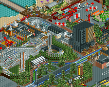
Screenshot / Central Pond
-
 30-December 15
-
 Dreamworld Rec.
-
 1 of 2
- Views 2,797
- Fans 0
- Comments 15
-
 Description
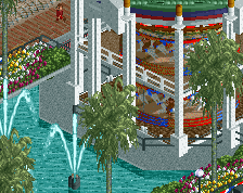
Won't be able to post a screen tomorrow so thought I'd post a celebratory New Years screen today while I have the time.
Don't think anyone has seen this project yet, maybe once in a hangout...possible that release will occur next year, but I'm not even sure that I'll finish it yet. Not much has been done so far.
Unfortunately, being away this past week meant I haven't been able to spend any time playing RCT. Therefore, it's unlikely that my reddit entry will be completed in time but that's at least finishable, same applies to the NCSO design/park I was working on (although given how little I enjoy building on that I may just release it unfinished).
Hopefully 2016 will be as productive as 2015 for me :)
-Stoksy -
 Full-Size
-
 No fans of this screenshot
-
 Tags
Tags
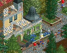


Looks fun! Lots of path though, I suggest adding some bins, lamps or benches.
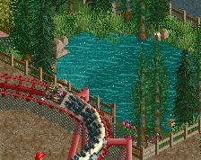
Not that much content, but what is there looks pretty good. Digging those sunshades. Not sure what the objects are supposed to be in the remote control boat pond?
Stoksy's Color Kick! I'm lovin' it!
I would try to add more large bursts of foliage or at least some taller trees around the pond; the flowers just aren't cutting it.
I like the use of the flowing monorail under the water, nice job!
There's been a lot of orange use around here lately, and I'm liking it all! However, I feel the mix of other colours aren't sitting too well, particularly the whole red/peach/orange combo. As Steve and Coasterbill say, I don't think the flowers fit (at least, not with their current colour), and that more of the tropical bush would probably work better. Other than that, looks great!
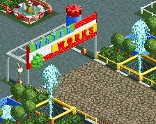
Maybe swapping out the grey path for something with a little more atmosphere could help. Also, that diagonal crown molding object would be beneficial too, definitely would clean up the building on the left a bit.
yikes @ that those umbrella colors
@Sulakke: The objects were supposed to represent obstacles, but I've gotten rid of them now. They didn't really add much to the area.
@G Force: I don't really want to waste object space importing the diagonal connector pieces at this time. If I've got the space then I will, but the objects that I'm using serve enough of an acceptable purpose at the moment. There's so much architecture around this area, I don't think that it detracts that much. Grey path is the best I could come up with really, it has to be tarmac in my opinion. Brick is too much and better suited to the sidewalk, off-white is too bright, and other path options are too textured in my opinion. Obviously any suggestions would be much appreciated.
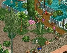
@Steve, Bill, Choco: The surrounding pond flowers are based on this: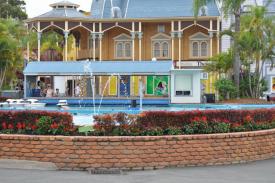
I wasn't sure how to translate that in another way without also extending the barrier further than I wanted. Thoughts?
Maybe try the Cena/Liampie path we used in Paradise Pier and I used a bit in Westwinds. Just really not feeling the tarmac here, it almost never looks goon in my opinion. Could just be the unfinished nature of the screen though, lamps, bins, benches, and peeps could help.
Love to see more
looks fun man
sleepyseaotter Offline
Hi there,
Still working on that Dreamworld?
knowing stoksy i'm pretty sure that answers gonna be 'no' haha