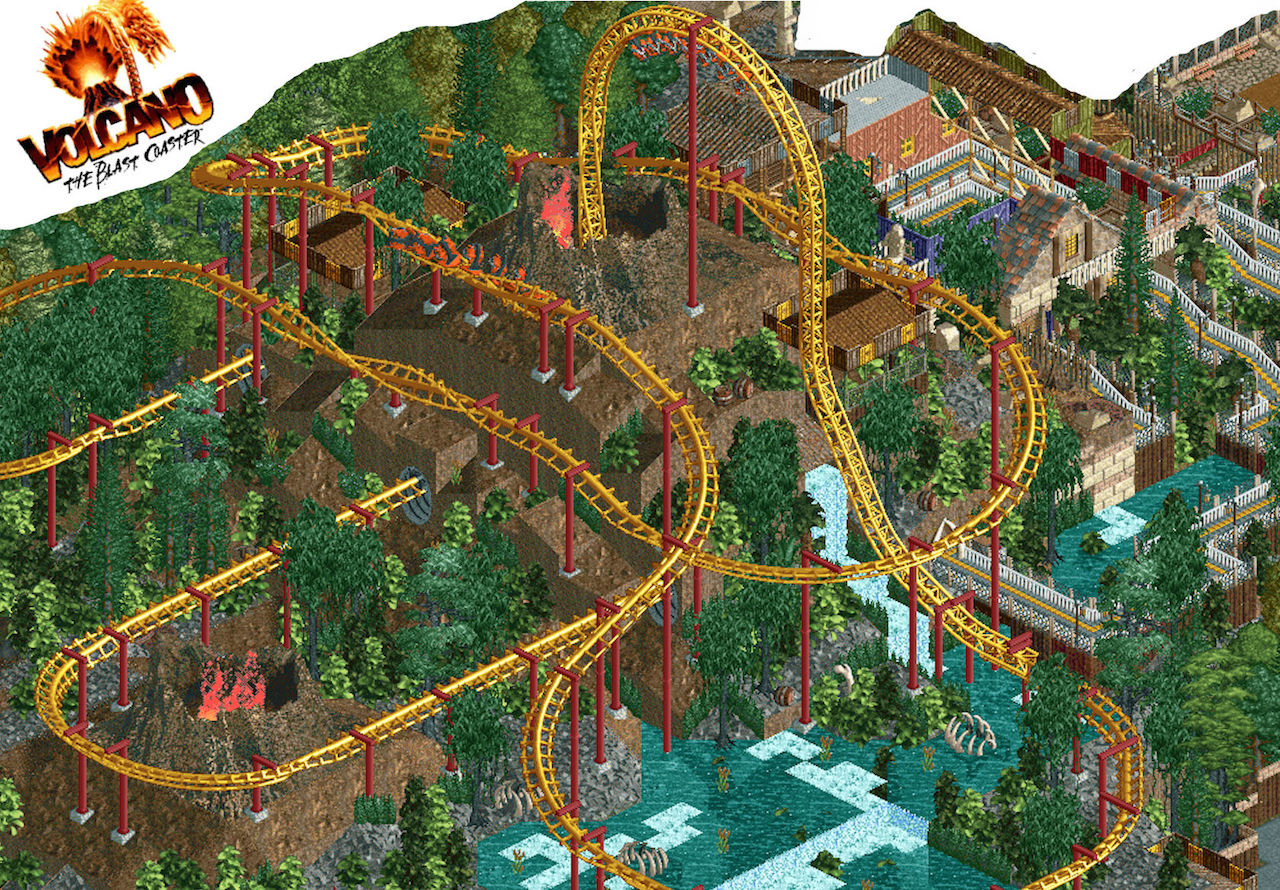
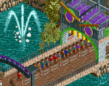
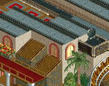
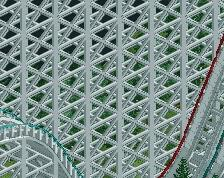
Screenshot / Volcano: The Blast Coaster!
-
 19-December 15
-
Paramount's Magic Mountain
-
2 of 16
- Views 3,039
- Fans 0
- Comments 15
Community Forum Software by IP.Board
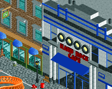
Pretty cool, but both of these screens show absolutely nothing new in term of skill progression, park ideas, etc.
A sequel is good, but make it better than the first one.
Yeh it feels like your last park with the dial turned up to 11
I am still in the process of adding more CS items and stuff. That is what I did with my last park. Over time I added more items and details to my rides and buildings. I can't do it all at once because it just confuses me and seriously stresses me out. I just go with the flow of building tbh. Like I obviously know this looks like my old parks style. At the same time though its the way I build. Just these screens were like progress screens more then finished screens. Which I know people hate on this site, but I just wanted feedback before I go further on with this project. Also I haven't played since my Thanksgiving break, because my RCT2 is on my old Dell home computer. lol
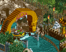
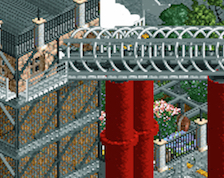
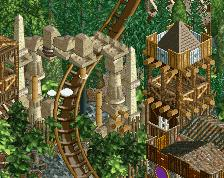
Oh and this is dumb for me doing since i already posted the screen shot, but i added catwalks and LIMs to it.
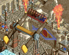
Have you thought about adding custom supports?
Nothing wrong with that
Volcano, not Valcano lol. If this has the same quality + improvements of your old park it'll be a joy
lmaooo
Is it just me, or does the layout look weird? It seems like if there's a real example of a coaster with a weird layout, a recreation or an "inspired-by" take on that coaster allows you to get away with awkward transitions and flow, but if it's a made-up layout, you'd get called out on it immediately. Based on that, I'm not really a fan of the coaster persay, but since it's based on the real coaster I guess I can't fault you for its awkward appearance and layout... though then I would say that custom supports for those in-line rolls would probably make it look more like the real deal and add some more detail to the screen.
pretty sure your coaster layouts are just as wacky as mine sir
It's cool you're doing round 2 of your last park, hopefully the sequel meets the same high standards you already set for yourself! Your screenshot is blurry-ish, it's messing with my brain. Try not to resize them before you post.
True, but they are in a fantasy setting, and I get critiqued for it. In contrast, a wacky layout like this in a real-park inspired setting doesn't get critiqued, despite the fact that it's awkward.
It really doesn't matter though. I'm not changing that layout, I think it's cute and solid. Sorry :/
I like it too, a lot actually. I also agree with nin's first post.